


by Larry Gordon
The University of California at Davis is a sprawling, well-regarded campus that is probably best known for its contributions to agricultural research that aids the nearby big farms in the Central Valley and growers worldwide. Not as widely known is that UC Davis has a strong arts program and a large art collection, particularly of prints, watercolors and ceramics. For example, contemporary painter Wayne Thiebaud (creator of those lusciously bright paintings of cakes, lollipops and farm landscapes) taught there and has donated many of his own and others’ work to the university. The school also has a trove of Old Masters’ prints from the 17th through 19th Century.
Now UC Davis, which is located just 18 miles from downtown Sacramento, is hoping to build a new home for its art collection to replace the small Nelson Gallery on campus. With the help of a $10 million donation from publishing and wine world magnate Jan Shrem and his wife Maria Manetti Shrem, the school is planning a $30 million museum to be constructed by 2016. The site is just across from a performing arts center and, giving it further prominence to a wider community, is next to the busy Interstate 80 highway with traffic to and from San Francisco. So the goal is to design and build a museum that would engage both the campus audience of students and faculty and the wider group of off-campus visitors from northern California, officials said.
“We wanted this to be a gateway, a kind of iconic building” said Clayton Halliday, UC Davis’ assistant vice chancellor and campus architect.
Jessie Ann Owens, dean of humanities, arts and cultural studies, noted the difference between an art museum in a city and one on a college campus that enrolls 33,000 students. Besides displaying and protecting the art in the best manner possible, the school’s museum must be an education center as well, with classrooms and working studios. It should be, she said, “a place where students would want to come. And a place that would be important not just for students in the arts, but for students and faculty from all across the campus.”
With those ambitious targets, UC Davis decided to hold a design-build competition among teams that already combined a design architect, an executive architect and a contractor. Having the teams already in place would save time and money, the university said. Officials first sent out RFPs in fall 2012 to a wider group, whittled down the respondents to seven and then, after interviews, reduced the list to three groupings by December. Each of the three finalist teams was given a $125,000 stipend to develop a design.
In April, the proposals were publicly presented in a series of meetings and displays that generated much discussion on campus and the region. A jury of faculty, administrators and art experts announced their selection in early May.
The three teams and their proposals were:
1. SO-IL, design architect; Bohlin Cywinski Jackson, executive; Whiting-Turner contractor.
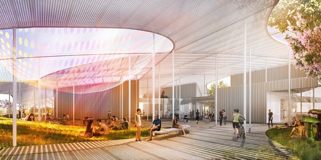
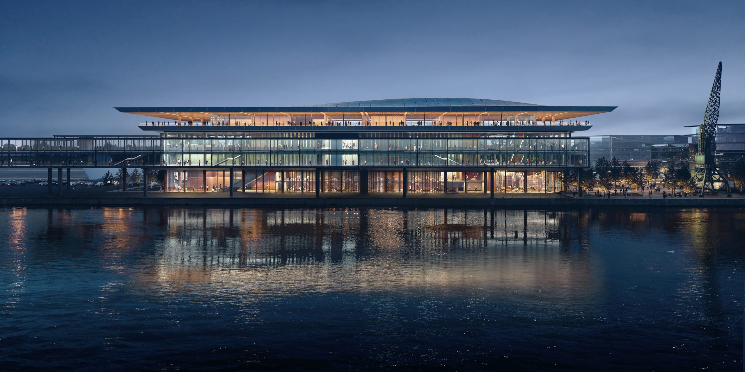
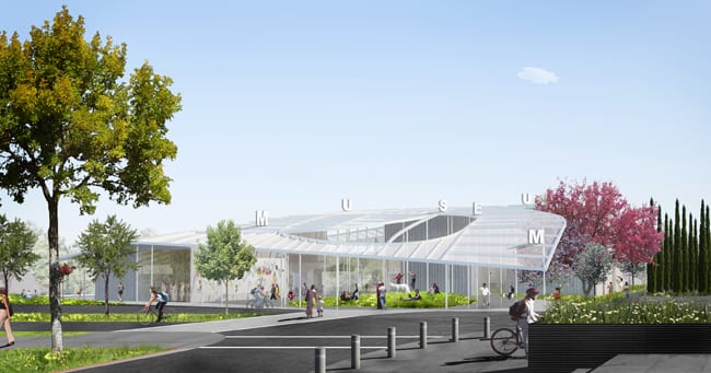
This was the winner: for a proposal known as the Grand Canopy. The main gesture is a 50,000-square feet metal canopy that undulates over open-air plazas and a series of museum buildings. The mini-campus beneath the canopy includes three structures, totaling about 29,000 square feet, extending like spokes from a central lobby. All one-story and in sight of each other, the buildings separately hold galleries in one; classrooms and studios in another; and administrative offices and support services in the third. The perforated canopy, held up with delicate poles that range from 11 feet to 30 feet high, takes advantage of the warm Davis climate yet provides shelter from the strong sun and occasional rain. At the center, a small grassy hill under a canopy hole brings in an extra touch of nature and creates a sitting area to watch performances or art projections. And the exterior can be lighted at night to provide an attraction from the freeway.


Site plans by SO-IL (click to enlarge)
A college museum should not be “a closed bastion for the arts but be something much more open, much more welcoming, much more inviting,” said Florian Idenburg, who, with his wife Jing Liu, heads up the New York-based SO-IL (The full name is: Solid Objectives-Idenburg Liu). Idenburg said they were inspired by the surrounding farm landscapes of flat land and curvy rivers as well as by the landscape paintings and prints by Thiebaud and others in the art collection itself. In addition, they thought about light-framed agricultural buildings like sheds.
The design tries to avoid any monumental museum in an attempt to appeal to students, Idenburg explained. The campus museum should “be able to connect to a mindset that is being shaped. So this is something that is less programmed or determined, something that will have to catch or seduce the students and their imaginations.” He said it aims to be “an open structure that people can take over and occupy or reject or find their own values in it.” The galleries are meant to be changeable over time and can even be expanded easily.


SO-IL’s “Grand Canopy” concept engaged the jury in very positive ways. (The participation of the large Bohlin Cywinski Jackson firm helped, with its reputation for designing audacious and elegant Apple stores.) Jurors particularly liked the way the educational classrooms, studios, galleries and administrative offices were all put on the same level and given equal prominence. “It was the most forward thinking about the role of the museum in the 21st Century as more than just a repository. It is a platform for events,” said the museum’s director Rachel Teagle, who was a juror. A visitor under the canopy will be able to see students gathering for a class, artists at work, galleries having a show and the employees at their duties, all in what she described as “a transparent institution.”


UC Davis design professor Tim McNeil said he and fellow jurors felt that the gently curving canopy fit in well with the wider agricultural vistas around UC Davis and mountains in the distance. And it seemed to allow for the structures below it to expand and evolve over time while maintaining the sense of indoor-outdoor space, he said.
Owens, the UC Davis dean, said: “I was entranced by the way it connected to the feel of UC Davis. It feels like Davis, it smells like Davis. It was not one of these buildings that could be anywhere.”

Drawing by SO-IL (click to enlarge)
One big concern, however, remains about the material and texture of the canopy, which is under study. It needs to be attractive both from the highway and up close. Some campus officials don’t want it to be fully porous because the museum wants protection from the rain. And it needs to be easily cleanable, since a lot of dust blows to the campus from farmland.
UC Davis hopes for a ground-breaking in February 2014.
2. Henning Larsen Architects; with Gould Evans as executive; and Oliver and Co. contractors.
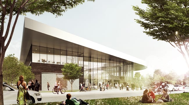
Their inspiration for the shape of building’s signature element -an overhanging roof- was a tree leaf tugged at its edges. The two story, glass-fronted building has “a presence but is also light in its architecture,” according to Michael Sorsensen, a senior design architect of Henning Larsen, which is a multi-national firm with home offices in Copenhagen.
In front, an outdoor ramp and grassy slope would lead visitors from the ground level to a public courtyard on the second floor; the designers hope the exterior ramp would become a public hangout space like the steps at the Metropolitan Museum in New York. (Some campus officials feared it might become skateboard-central.) The interior lobby is a dramatic double height space lined on one side with shelves where students could hang their own art. The formal galleries around it would have some pivoting walls that allow for flexibility and changing spaces. The second floor courtyard, punched like a hole in the middle of the leaf, is open to the sky and warm California climate and could be a spot for receptions, films and lectures protected from any freeway noise.


Jurors particularly liked the student-friendly lobby but said this project did not win in part because it raised security issues of having too much public access to the upper floor courtyard and to offices and classrooms surrounding it; some said the courtyard seemed disconnected to the galleries on the floor below. Beyond the skateboarding concerns, the outdoor ramp also worried some because its pathway seemed too convoluted.


Presentation boards by Henning Larsen Architects (click to enlarge)
3. WORKac, design architect; Westlake Reed Leskosky, executive; Kitchell contractor
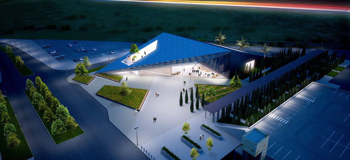
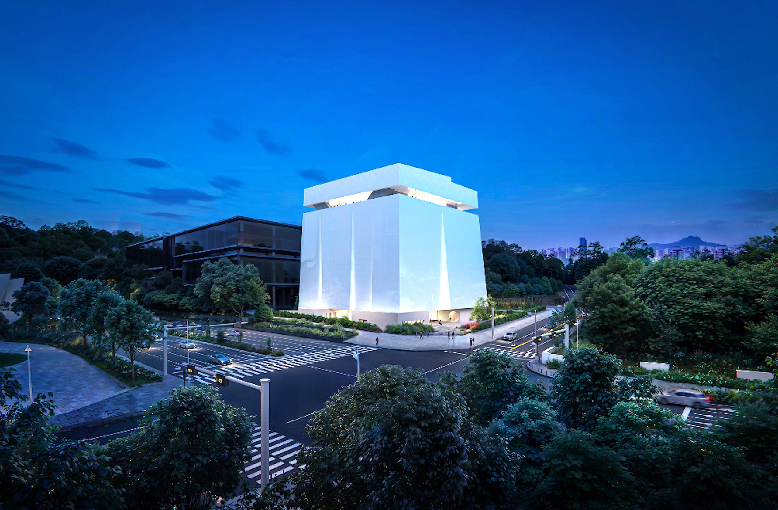
Called “the Slant,” the proposal was the most dramatic of the three and elicited the most divided comments. Its exterior is a origami-like twisted parallelogram with a steeply slope metal roof that comes down to the ground at some points and is pulled up high at other spots to create shaded plaza. Its iconic design, punched with windows, was meant to create a “wow effect” from the highway while also providing friendly gathering spaces inside and beneath its outdoor canopy, according to the presentation by Dan Wood and Amale Andraos, principals of the New York-based WORK Architecture (WORKac). It is meant “to look different from every angle,” Wood said. Super graphics of artworks could be shown on the metal superstructure and the entire building could be lighted to glow at night.
Inside it has what the designers called a “tribune,” a wide wooden staircase and structure that includes a rising series of platforms for showing art and some small seating areas for discussions. It would lead from galleries on the first floor to education spaces above.
The “Slant’s” audacious geometric and sculptural design appealed strongly to some jurors and campus community members who thought it would become a landmark for UC Davis. But others thought it was too brutal, too formidable. And, given undergraduates’ propensity to explore where they shouldn’t, some administrators worried about the way its roof practically touched the ground, unintentionally inviting climbers to scale its heights. The interior tribune and stepped display area were praised as a gesture and idea, yet also triggered concerns about keeping the artworks on it safe and meeting rules for accessibility for the handicapped. Plus, some jurors said they worried whether the entire Slant project might prove to be so complicated that it would bust the budget.


Renderings, elevations, and plans by WORKac (click to enlarge)
Larry Gordon, based in Los Angeles, is a frequent contributor to Competitions.