


This is not what we fought for!
by Wilfried Wang*
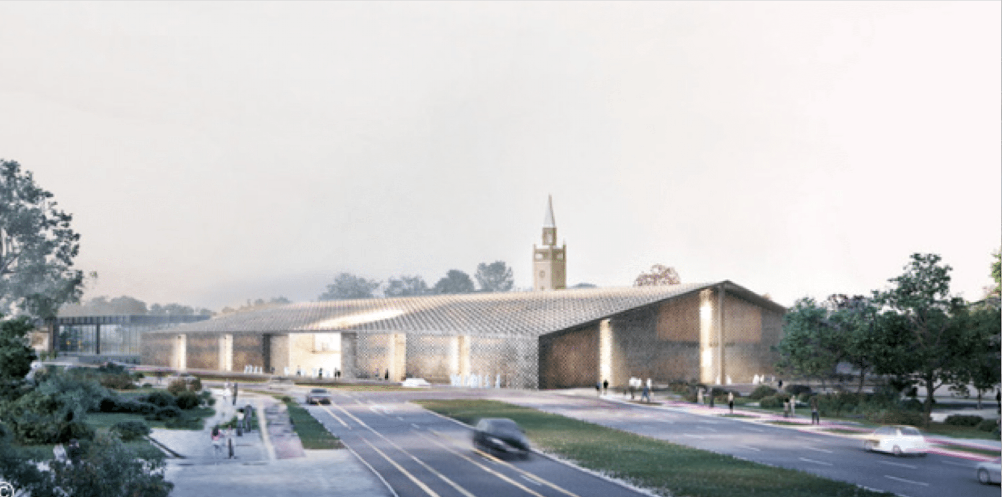
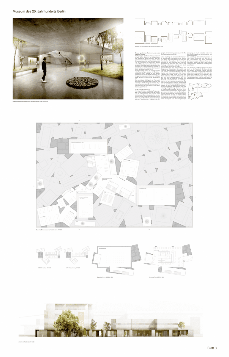
Winning design: ©Herzog & de Meuron
Wilfried Wang’s commentary on the competition results for the extension of Mies’s Museum of the 20th Century (M20) was published in the German journal, Bauwelt (40.2016). The author is the founder of the Berlin architectural practice Hoidn Wang Partner with Barbara Hoidn and has been the O’Neil Ford Centennial Professor in Architecture at the University of Texas at Austin since 2002. The text, translated by the Editor, is a slightly modified version (by the author) that appeared in Bauwelt.
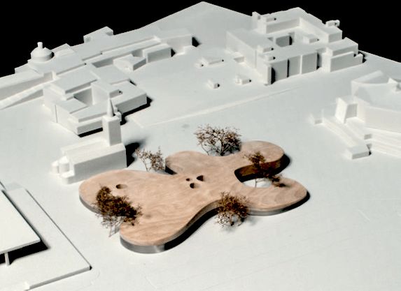
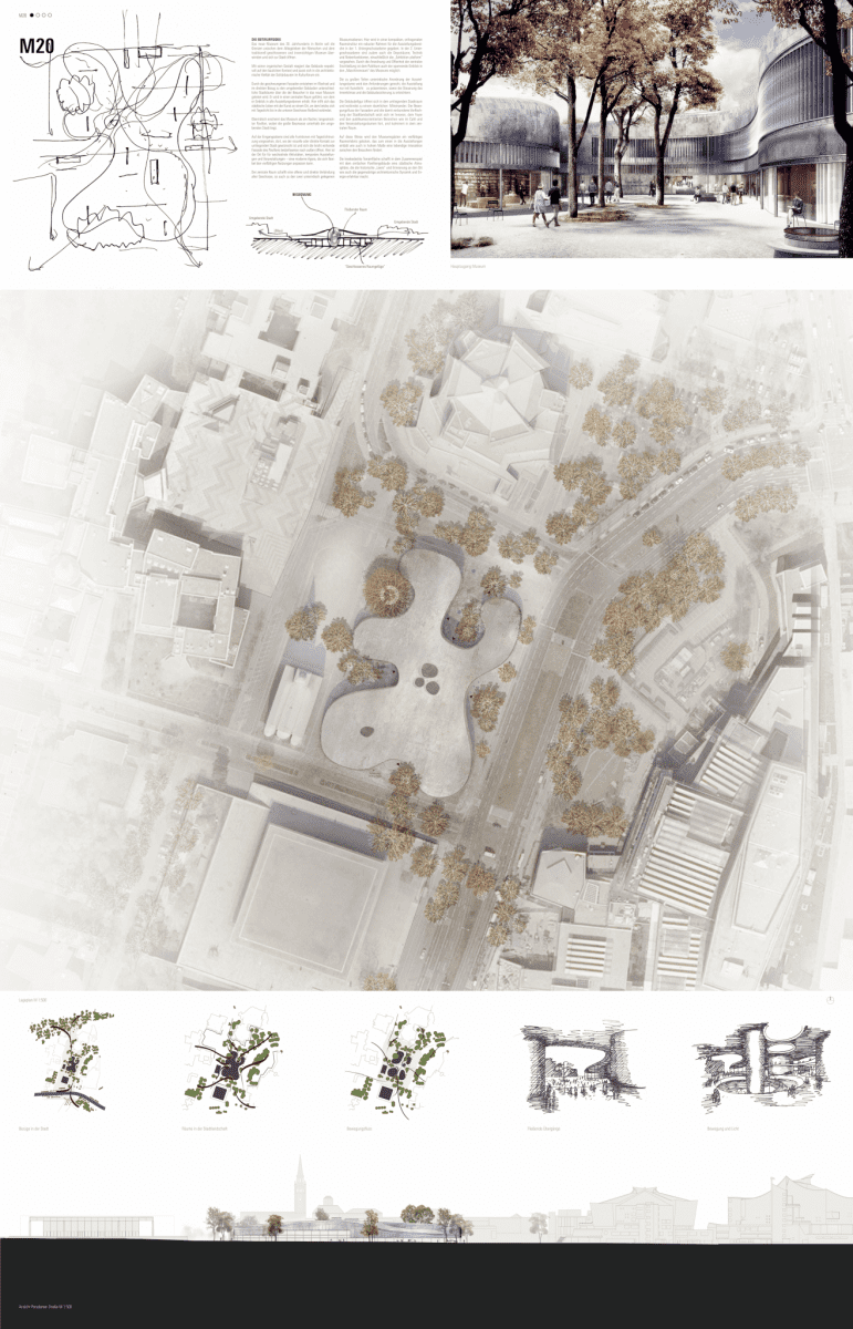
Both in architectural and urbanistic terms, the jury’s misguided selection of the Herzog de Meuron entry as the winner of the M20 competition is another missed opportunity for Berlin.
By extending the form of this introverted structure to cover the entire competition site, little or no value is added to the immediate environs. To the contrary, that and the immense surfaces of the facades, right up to the edge of the pedestrian walkways, only serve to diminish the importance of the surrounding buildings. All the trees to the south of the site will disappear, and 90% of the outer walls of the building, regardless of the suggested use of porous brick detailing, are completely closed off. Only the eastern entrance of the Herzog de Meuron plan faces the main entrance of Scharoun’s State Library; the other two main entrances lack any such connection with the urban context. Thus, the Cultural Forum gains nothing in urban quality, but rather the sense of desolation will increase.
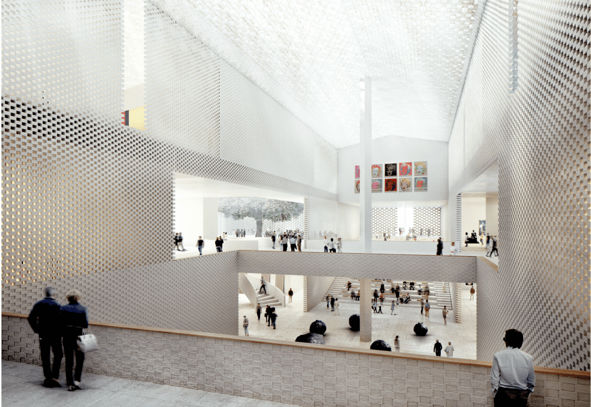
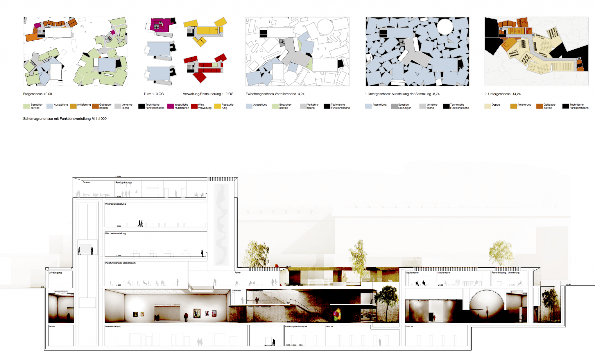
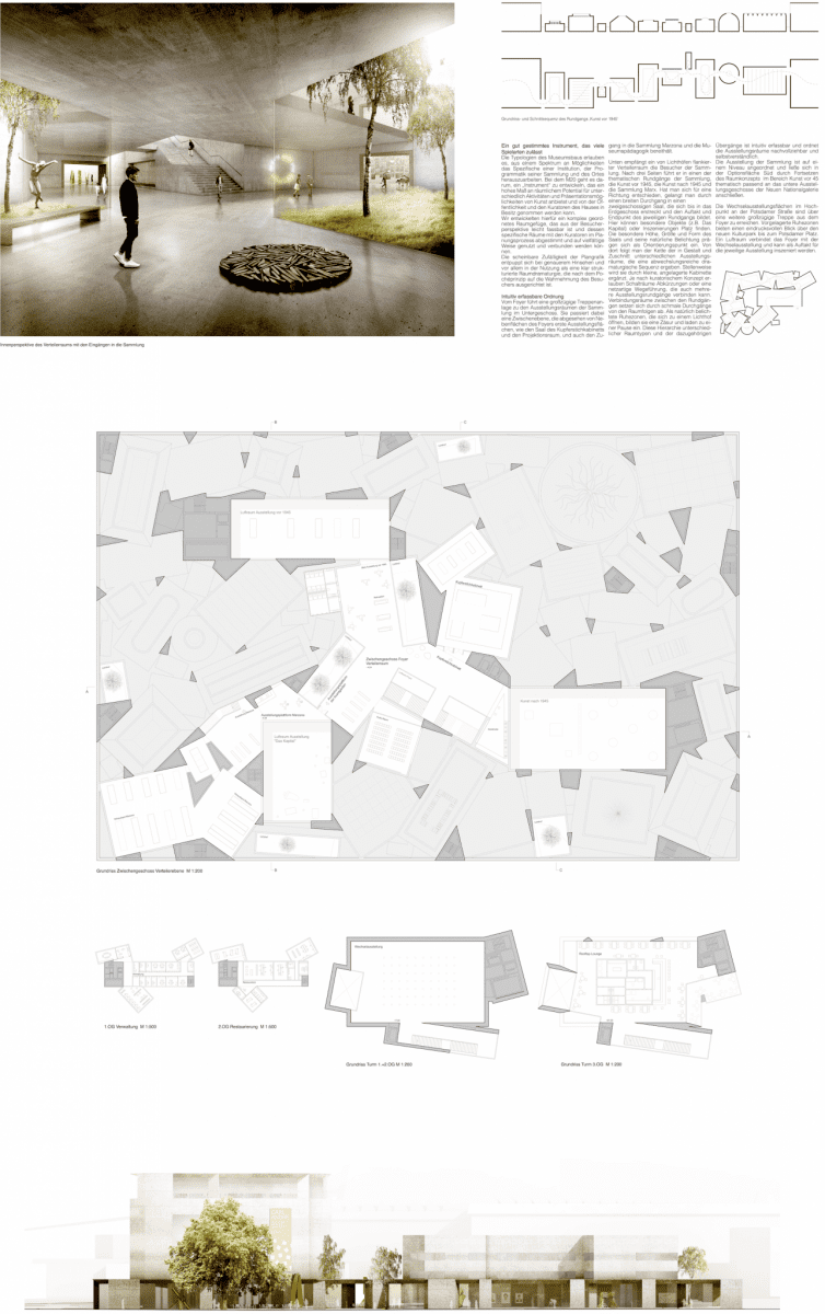
The corridors stacked over one another, labeled “Boulevards” by the architects, are connected in the quadrants by smaller corridors and stairs. The metaphor, “Boulevard,” is as misleading as was Le Corbusier’s “rue intérieur.” Boulevards are accessible 24 hours a day as open public spaces. In the evenings these corridors will be closed to the public.
Rectangular exhibit areas are placed on three levels—not easily accessible to the visitor as a result of the labyrinth-like circulation plan. What is so innovative about this? The Goetz Pavilion was innovative.
Viewed from an artistic- and architecture-historic point of view, the selection of this design was an egregious mistake. First of all, a gable roof design is not appropriate for this Cultural Forum, and, secondly, it does not express the modern spirit; actually it is quite the opposite. Originally, the Cultural Forum was not only West Berlin’s gesture to the East, but also an attempt to replace the Nazi north-south axis with a modern alternative.
The lack of sensitivity, unnecessary haste followed by yearlong inaction and a desire for label-architecture have strangely culminated in a provincial selection. The shortlisted designs from the initial open competition were more modern, sensitive, and led one to assume that a different solution would be in store.
If this design were actually to be built, this unfortunate selection process would result in a catastrophe. This reminds me of the competition for the City of Culture for Santiago de Compostela. In that instance I was the sole juror to vote against the Eisenman scheme. Then my arguments fell on deaf ears. I was not a juror in the M20 competition. For this reason, I’m thankful that I can air my concerns about this result; however, I believe that my concerns will once again suffer the same fate. -WW
*The following should be pointed out: For his Master’s degree in 1981, the author researched six cultural centers—amongst others, London’s South Bank Centre, Paris’ Centre Beaubourg and Berlin’s Kulturforum. In 1992 the author published a monograph on the work of HdM. The author was a member of the jury for the limited competition for the extension of the Basel Kunstmuseum, which was unanimously awarded to Gigon & Guyer; HdM was one of the five invited architects. In 2013 the author published a monograph on Scharoun’s Philharmonie, therein his essay on “The Lightness of Democracy.” As part of his activities in the Architecture Section of the Akademie der Künste in Berlin, the author was co-organizer of a number of public discussions on the development of the Kulturforum, in which politicians and representatives of the Prussian Cultural Foundation (the users of M20) participated. In 2014 and 2015 the author set the design of M20 as a test for advanced design studios. Finally, the competition entry for the first phase of the M20 selection process by the author’s office was eliminated in the first round: www.hoidnwang.de/04projekte_53_de.html.
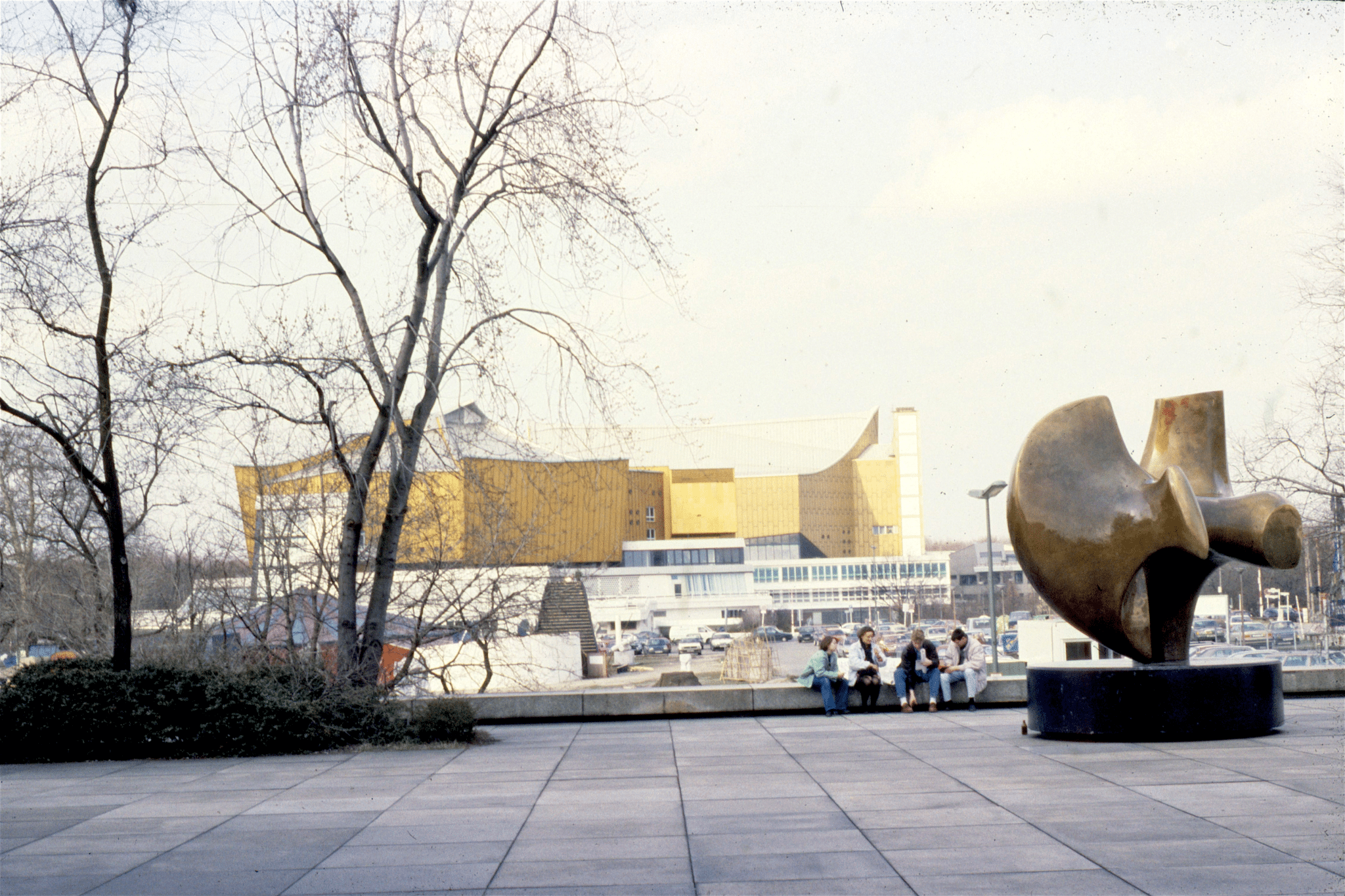
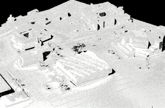
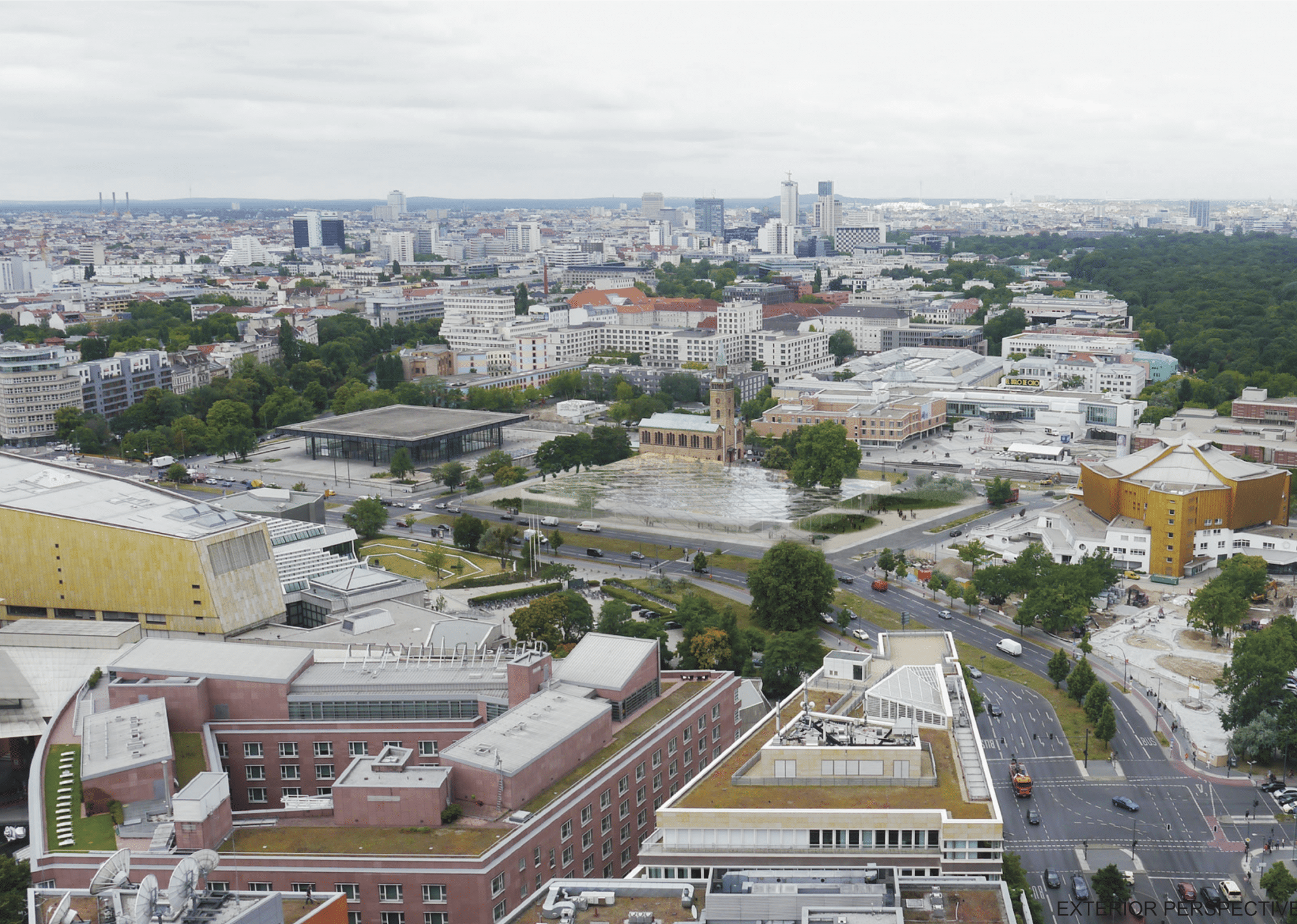
View of site from Mies van der Rohe’s Museum of the 20th Century to Hans Sharoun’s Berlin Philharmonic
Photo: Stanley Collyer
The above photo of the M20 site makes abundantly clear the difficult challenges facing the architects who tried to produce an acceptable solution for the extension of the Mies museum. One might normally assume that a grand plaza would have been an appropriate answer. However, an extension of the M20 came into the conversation when a major art collector offered the collection to the museum in its enirety—necessitating more exhibit space.So the solution to this expansion had to lie in a design competition.
First of all, the very presence of two easily recognized architectural icons facing each other across the site would normally be enough to intimidate anyone. So the initial question in the back of everyone’s mind would have been: should this addition simply constitute a link between the two buildings; or should it be something more?
Organized in two stages, the first, anonymous stage was open internationally and resulted in eight finalist entries advancing to a second stage:
https://competitions.org/2015/09/museum-of-the-20…tegration-berlin/.
From the 480 competition entries, one would have assumed that at least one entry would have been convincing enough to gain favor not only from the jury, but also the community. The addition of this second stage was to accommodate short-listed name firms, so there could be no complaints that high-profile, established architects were not part of the mix. Based on the final rankings from the second stage, none of the premiated designs really solved this challenge satisfactorily. Most tried to recognize the importance of a sightline between the two icons by going at least partially underground.

Site diagram
The two firms that took this most to heart were both from Japan—SANAA and, no surprise, Sou Fujimoto, with the latter covering the entire partially submerged structure with vegetation. The second-place winner from Denmark found favor from the main client with what looked to be very commercially looking solution, what one might imagine as an outdoor shopping center. The most extreme anti-urbanistic example honored by the jury with a merit award was OMA’s pyramid-like scheme, completely blocking any relationship between Mies and Sharoun by inserting their own icon in between the two.
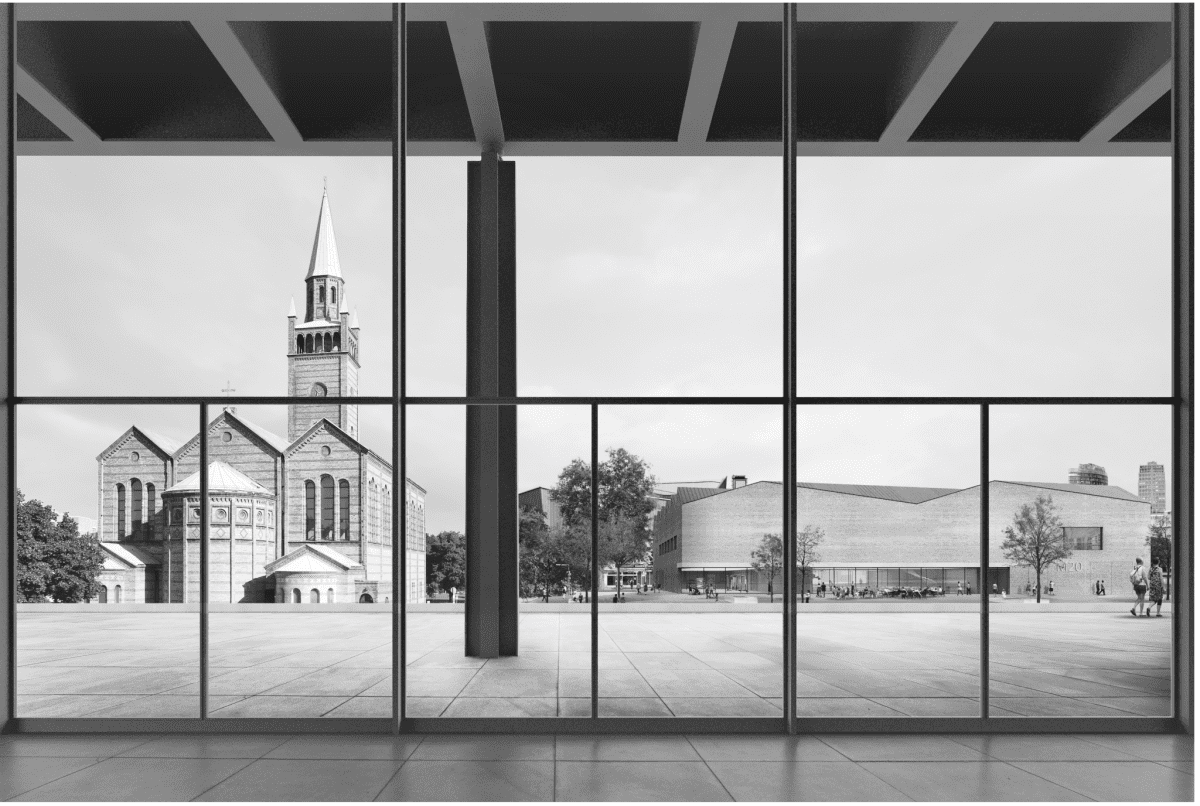
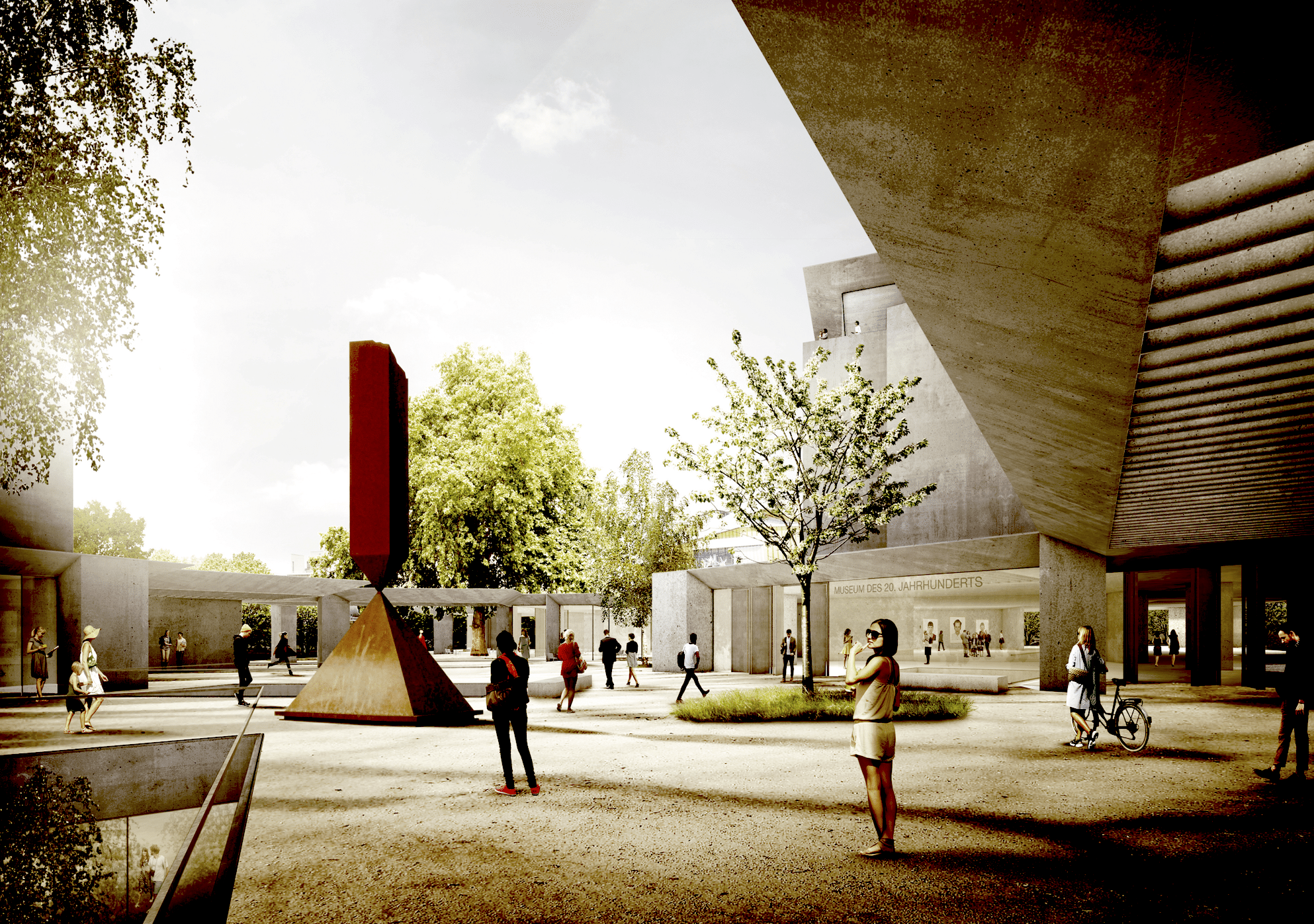
When Herzog & de Meuron’s design was declared the winner, it had to come as somewhat of a surprise. Structurally no more than a shed in appearance, it seemed to be completely out of character with all of its neighbors—almost thumbing its nose at them. The abundant use of brick, its blank facade facing the street, and the claim by the authors that the corridor cut through the middle as a “boulevard” would serve as a symbolic link between the Museum and Philharmonie, was hardly convincing. This is especially true when one realizes that it would be closed off evenings to all comers. As an urbanistic solution and example of architectural expression, the winner unfortunately fell flat on its face. -Ed
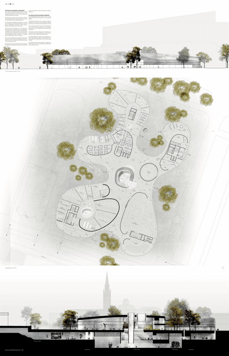
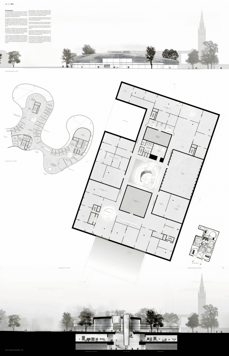
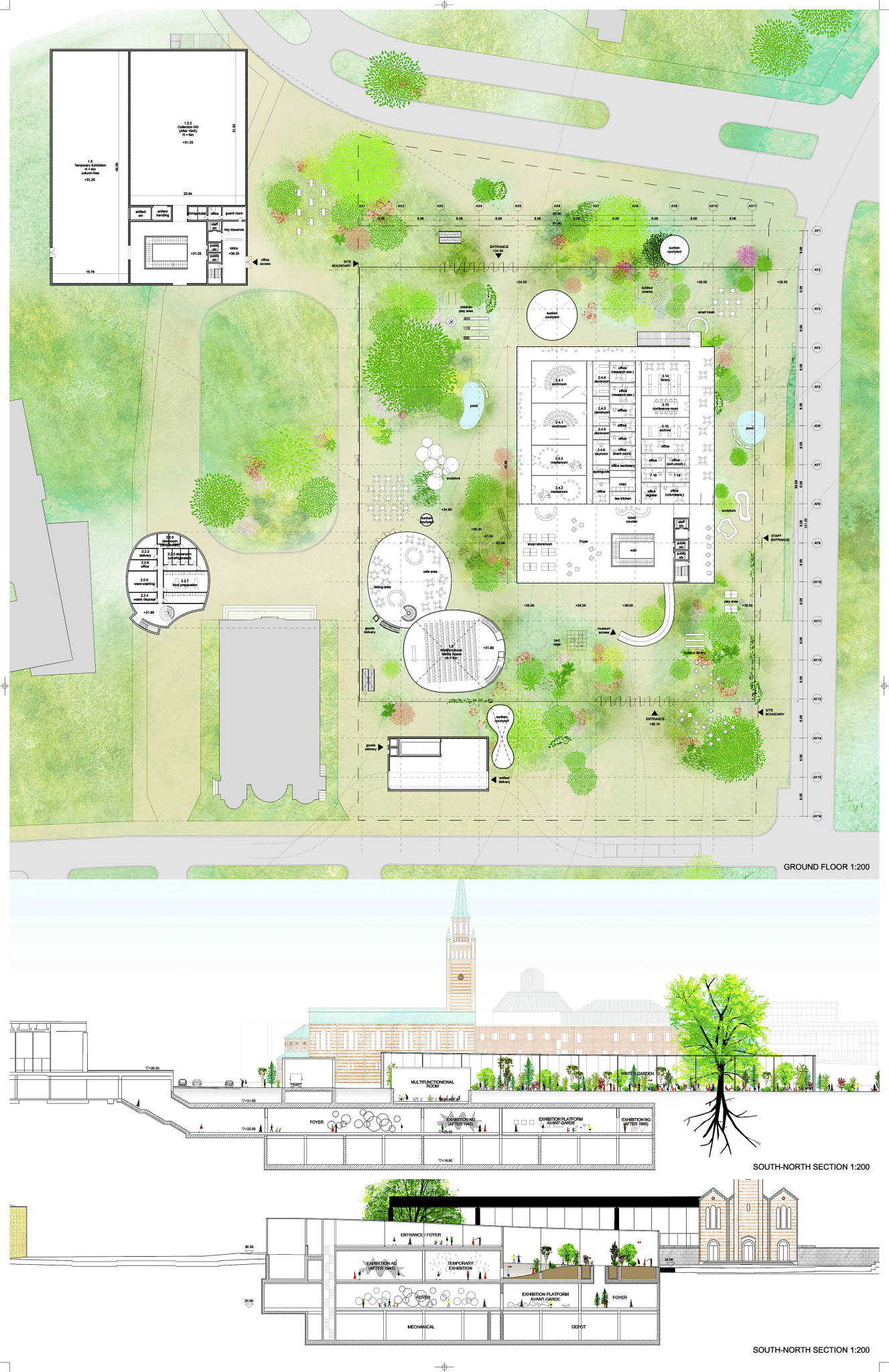
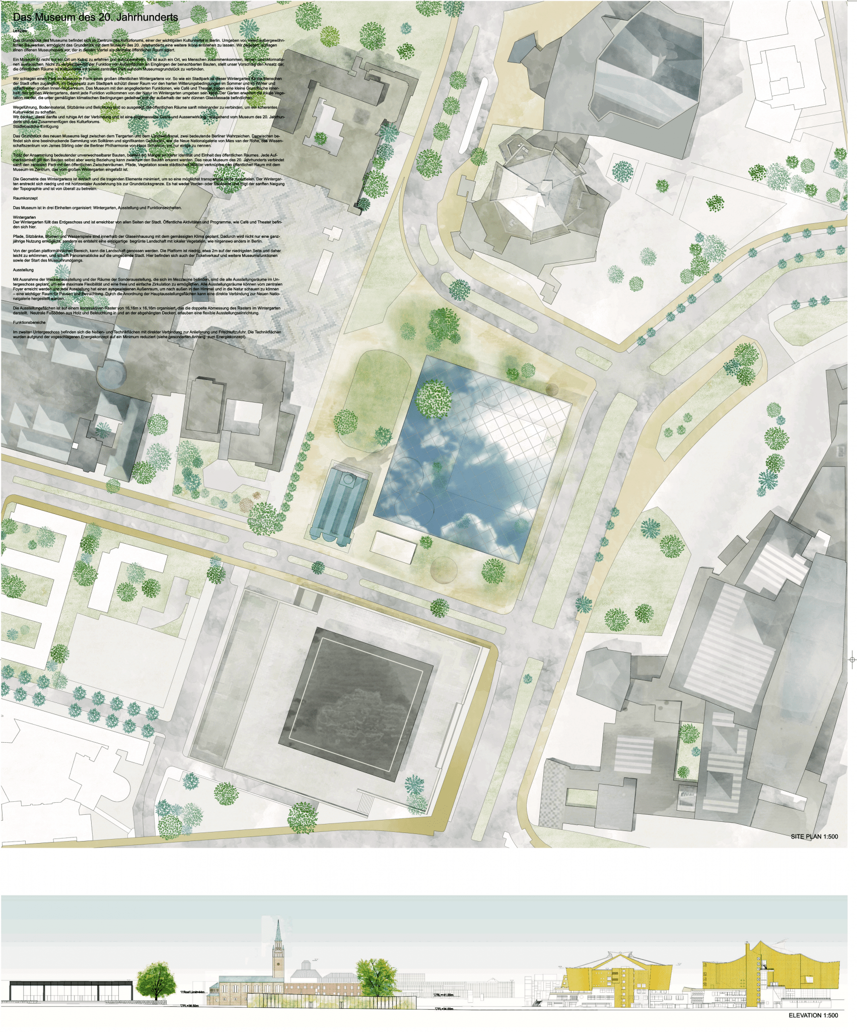
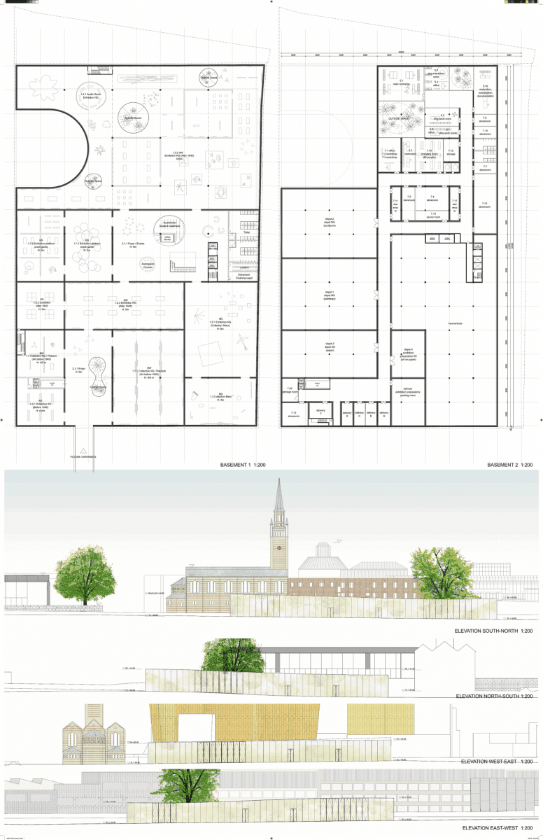
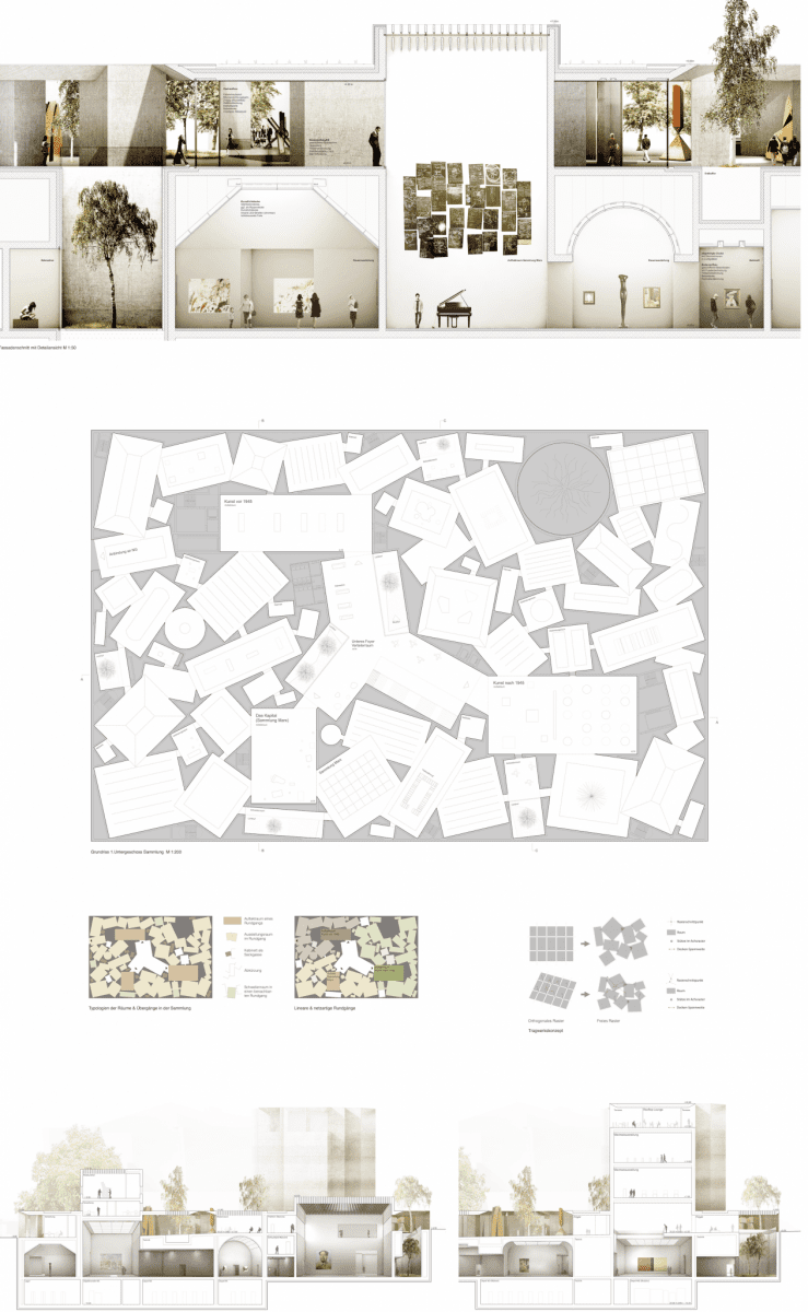
Winner
Herzog & de Meuron
Basel, Switzerland

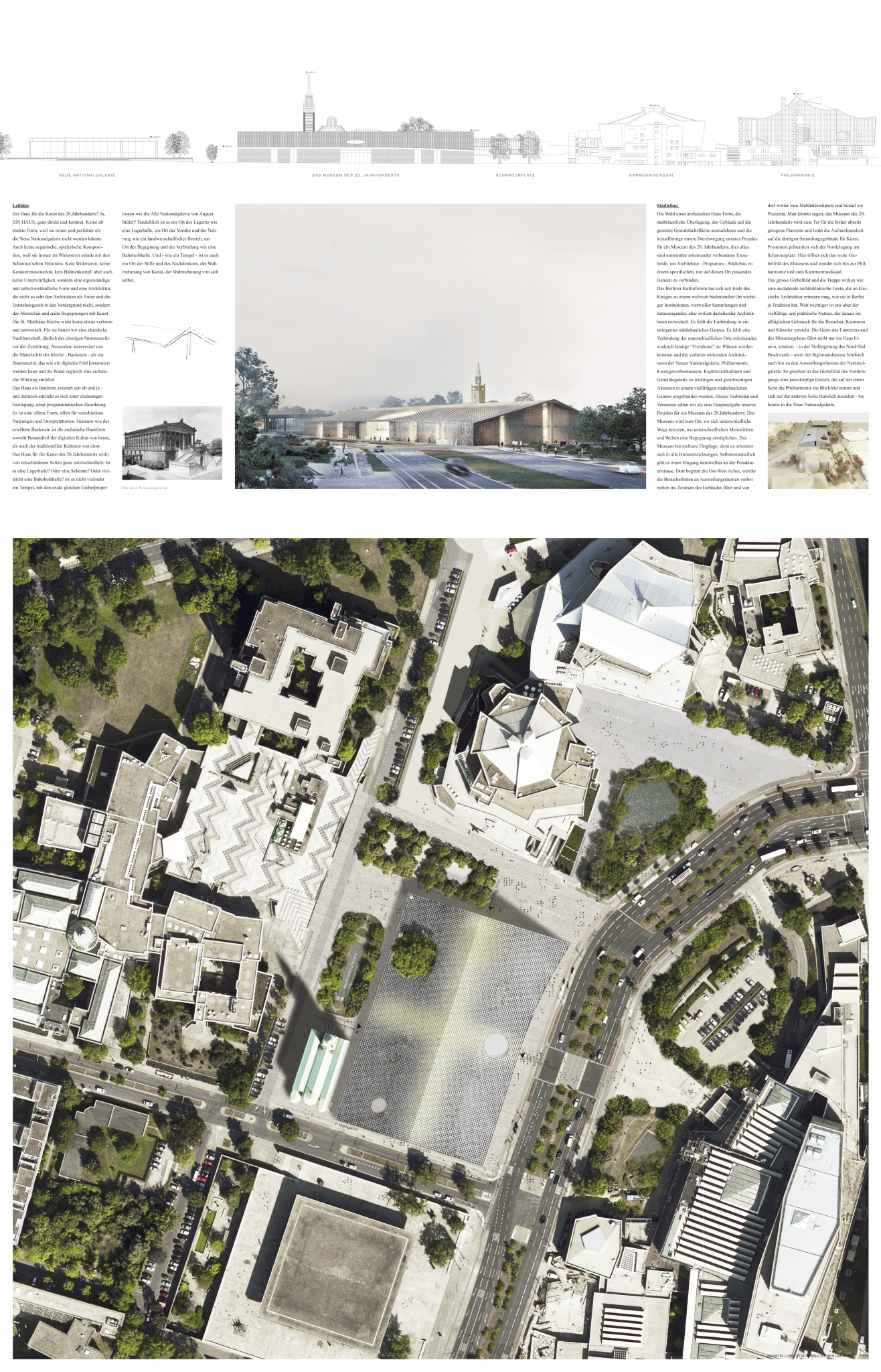
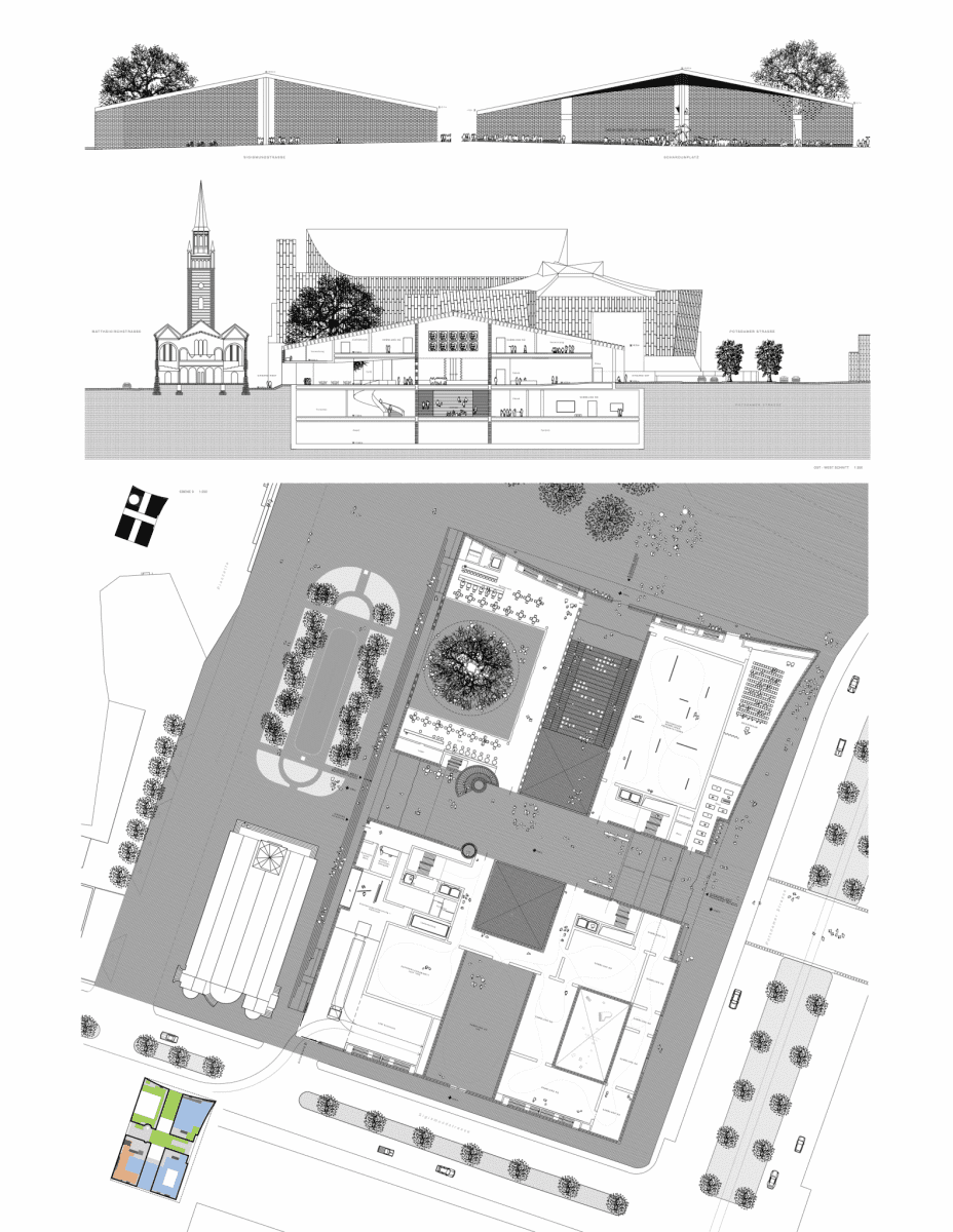

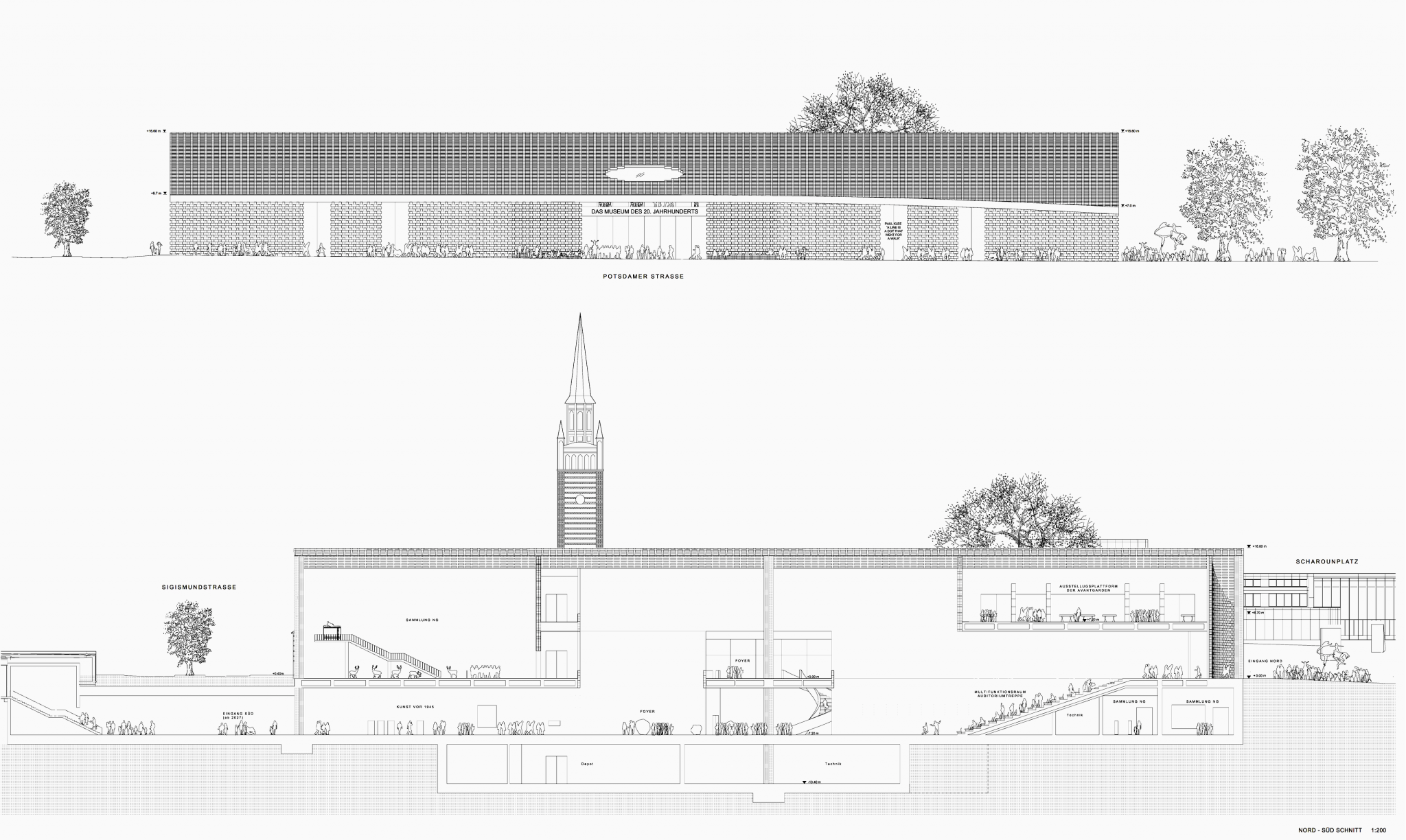
Images: ©Herzog & de Meuron
2nd Place
Lundgaard & Tranberg
Copenhagen, Denmark

Images: ©Lundgaard & Tranberg
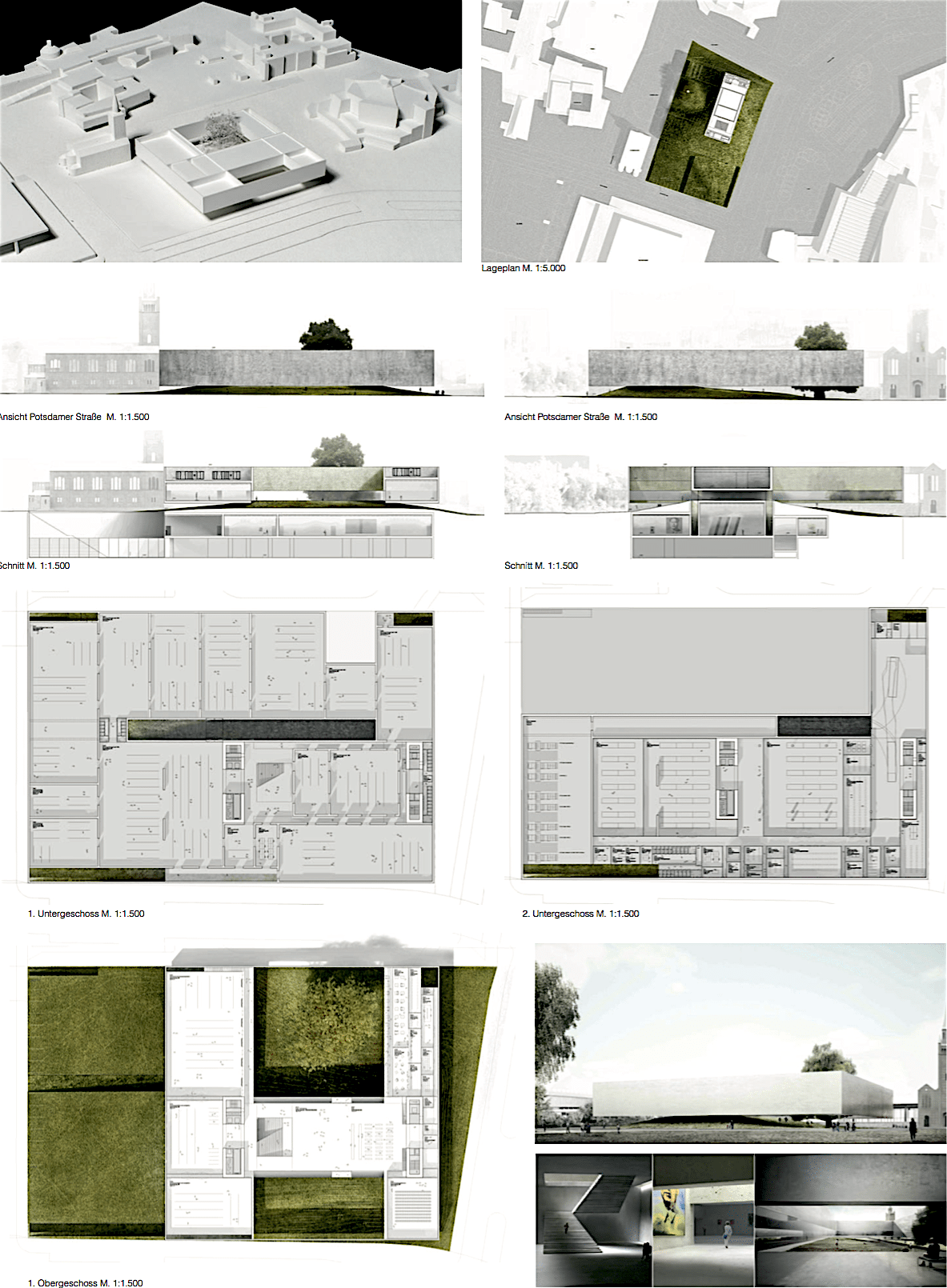
3rd Place
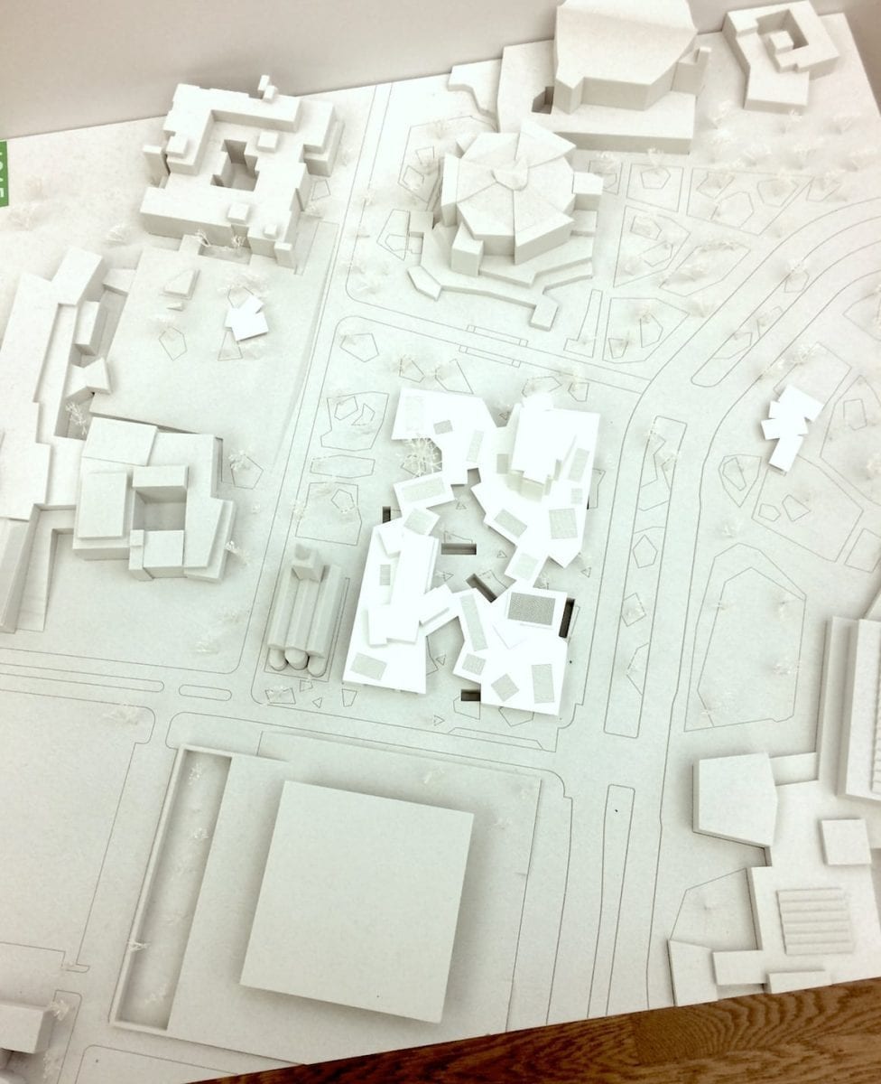
Bruno Fioretti Marquez
Berlin

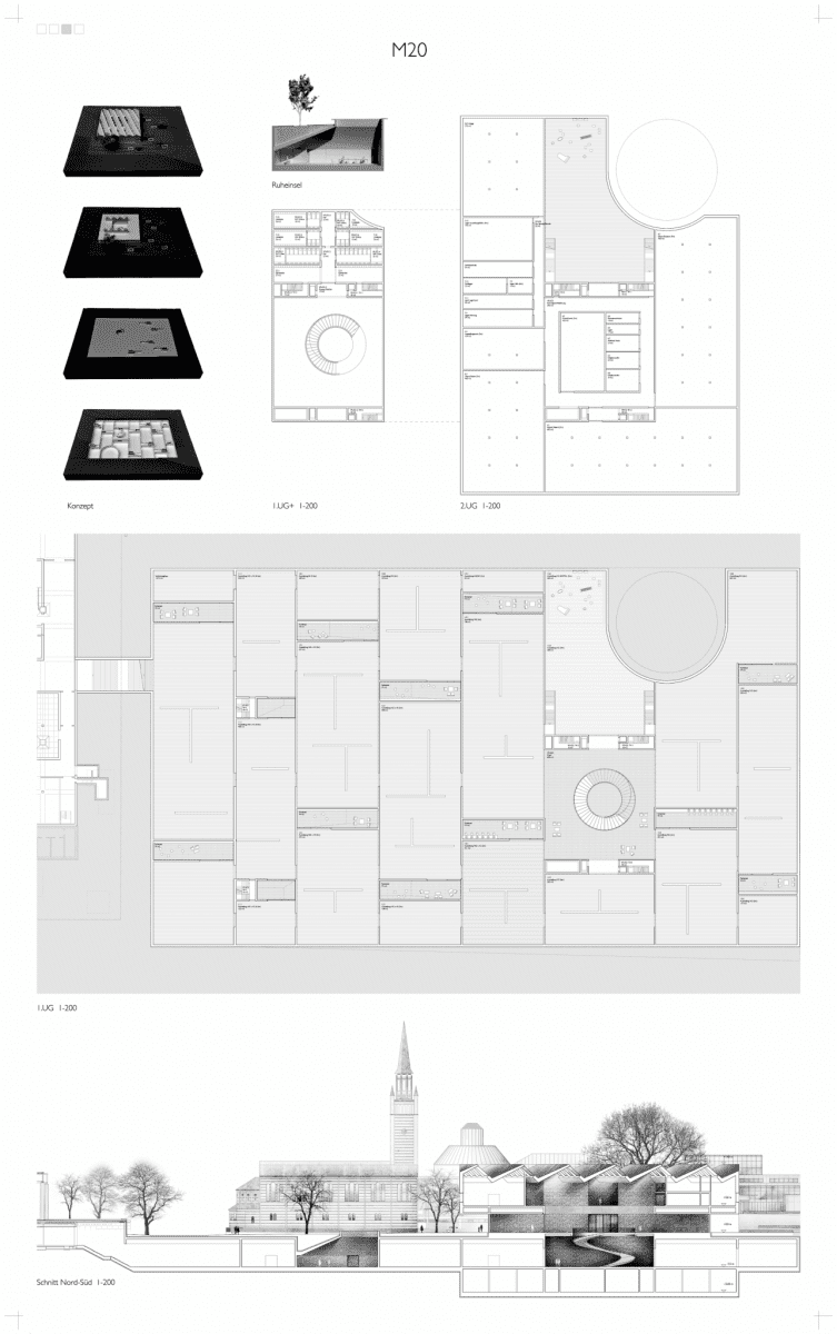
Images: ©Bruno Fioretti Marquez
Honorable Mentions
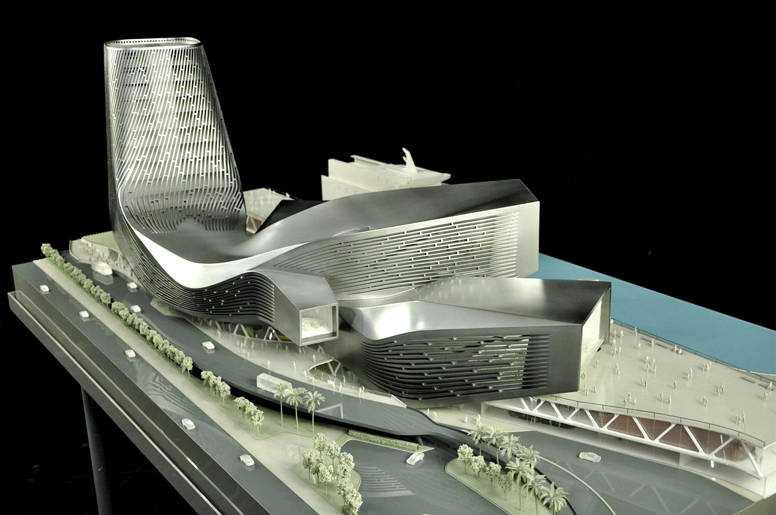
Office of Metropolitan Architecture (OMA)
Rotterdam

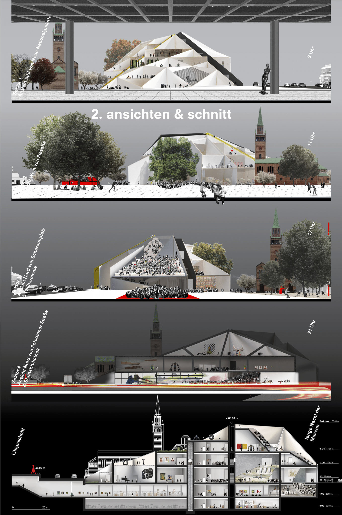

Images: ©Office of Metropolitan Architecture
Kazuyo Sejima + Ryue Nishizawa/SANAA
Tokyo, Japan
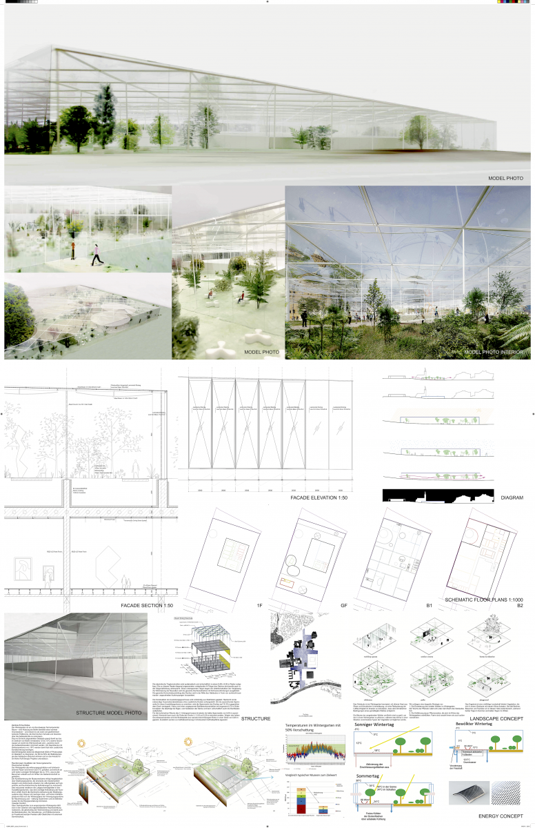
Images: ©SANAA
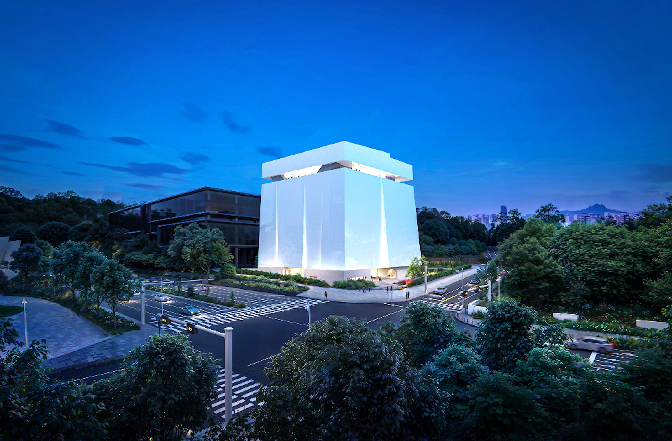
Volker Staab – Staab Architekten
Berlin
Images: ©Volker Staab Architekten
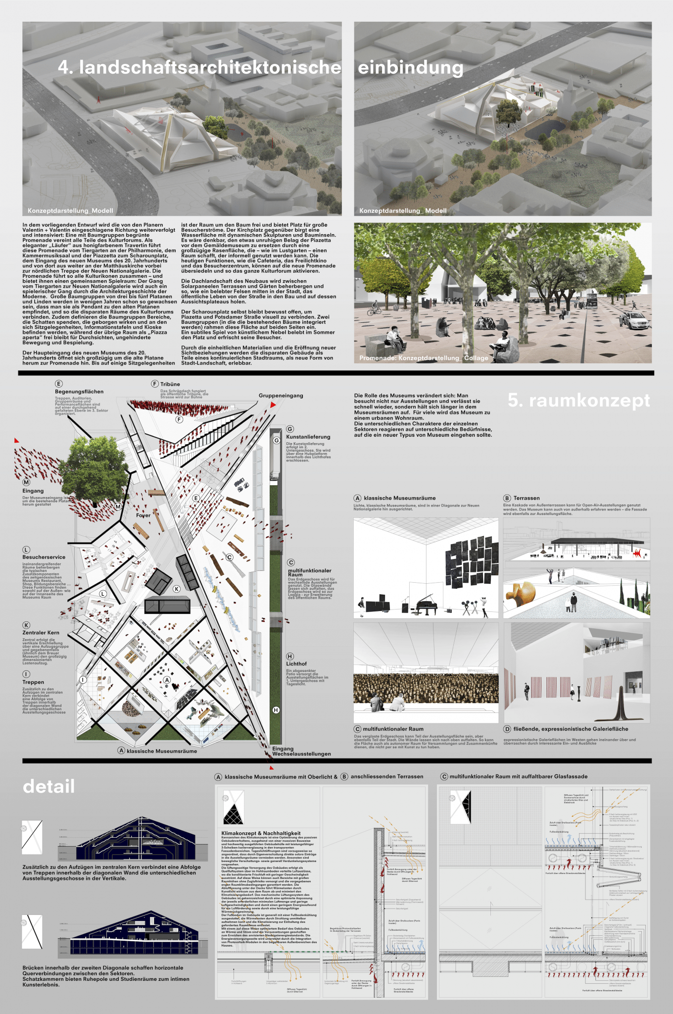
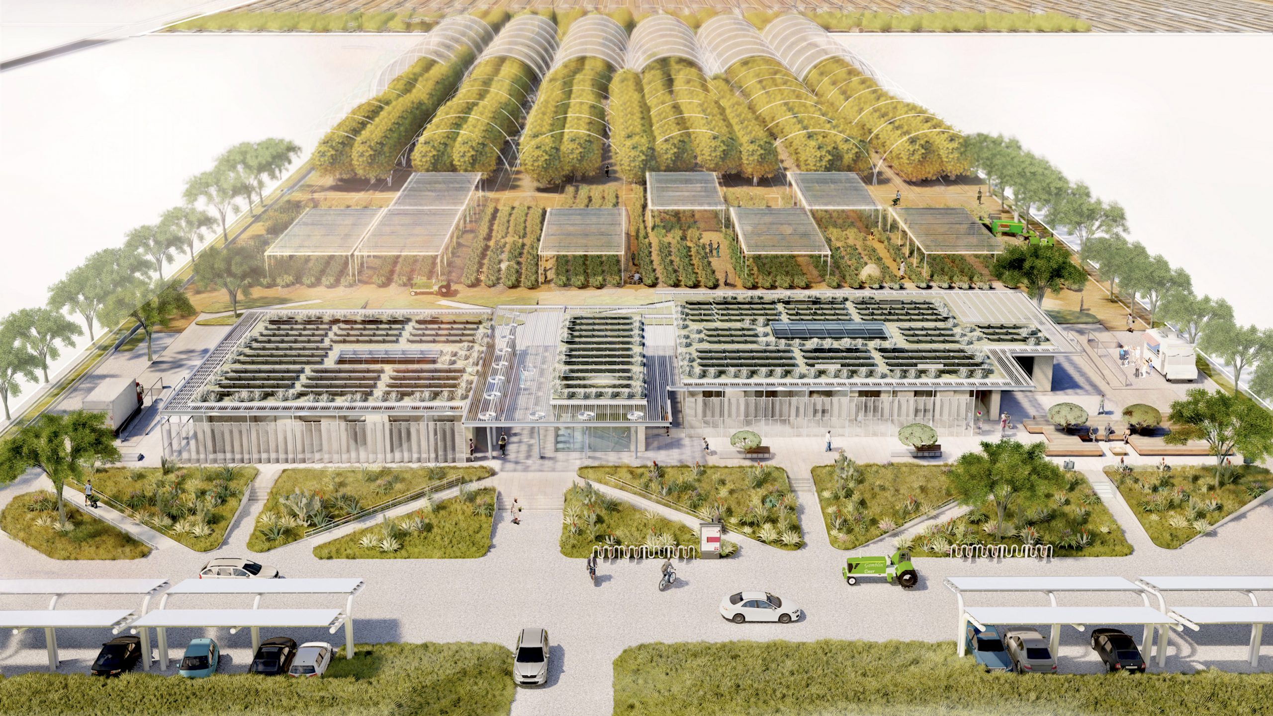
Aires Mateus & Associados
Lisbon, Portugal
