


by Stanley Collyer
Winning entry by Weiss/Manfredi
Serving the needs of students is one thing. Making a strong architectural statement as a program’s add-on is sure to bring lots of national attention to any educational institution. Chicago’s IIT was in the doldrums before it staged the Student Center competition won by Rem Koolhaas. Once that building was finished, enrollment in the architectural program there rose from 300+ students to 900! As a state university, Kent State would not envision such a dramatic increase in student enrollment, as the competition they recently staged for a new building to house their architecture program has its spatial limitations. However, as a byproduct, one may anticipate that a remarkable new building will undoubtedly result in more competition for those spaces.
As a program in close proximity to the Cleveland metropolitan area, the Kent State architecture program’s mission is, at least tangentially, furnished with a range of urban issues—there is no scarcity of those in Cleveland. One of the resulting outcomes of this connection has been the establishment of The Cleveland Urban Design Collaborative (CUDC, a combined effort of the graduate program at Kent State and the public service activities of the College of Architecture and Environmental Design. One of their primary activities has been the sponsorship of the Cleveland Design Competitions, focusing on subjects, remarkable for their diversity, such as schools, rail connections, and abandoned bridges. So a competition for a new building for the College of Architecture and Environmental Design might well be viewed in this context.
An initial request for Expressions of Interest resulted in a significant response. Thirty-seven firms furnished portfolios to the client, and, of these, eight were shortlisted for a second round of questions. They were:
- Bialosky + Partners Architects, LLC I Architecture Research Office (ARO)
- Bohlin Cywinski Jackson I SoL Harris/Day Architecture
- KZF Design with Morphosis
- NBBJ, Columbus, Ohio office
- Richard L. Bowen + Associates I Weiss/Manfredi
- The Collaborative, Inc. I Miller Hull Partnership
- Westlake Reed Leskosky, Ltd.
- WTW Architects with Overland Partners Architects
On November 19, 2012, the university selection committee narrowed the field down to four finalists, who were to receive a stipend for competing in the competition:
- Bialosky + Partners Architects, with offices in New York and Cleveland, in association with Architecture Research Office of New York
- Richard L. Bowen + Associates Inc. of Cleveland in association with Weiss/Manfredi of New York
- The Collaborative Inc. of Toledo, Ohio, in association with the Miller Hull Partnership of Seattle
- Westlake Reed Leskosky with offices in Cleveland and four other cities
It is notable that the list included only one stand-alone firm as lead designers from Ohio to compete against two New York firms, Weiss/Manfredi and The Architecture Research Office (ARO), and the Seattle-based firm, Miller Hull Partnership. Moreover, a lot of “star” architects were passed over for the job. This is not an unusual strategy by a sophisticated client, as they may often suspect that the ‘second team’ may be in charge of the project—although we had no indication here that this factored into their decision in this case.
Recent architecture school designs have relied heavily on large, open spaces to accommodate all class studio levels—most notably at Florida International (Bernard Tschumi) and Ohio State University (Mac Scogin Merrill Elam). Faculties in those programs have suggested that such an arrangement leads to more interaction among instructors. Here, the four finalists came up with different approaches to the design challenge. Whereas three of the finalists relied on the tried and true “street” solution (in three different variations), one finalist chose a more scattered approach. In the end, the Weiss/Manfredi – Richard L. Bowen team prevailed and won the right to negotiate for a commission.
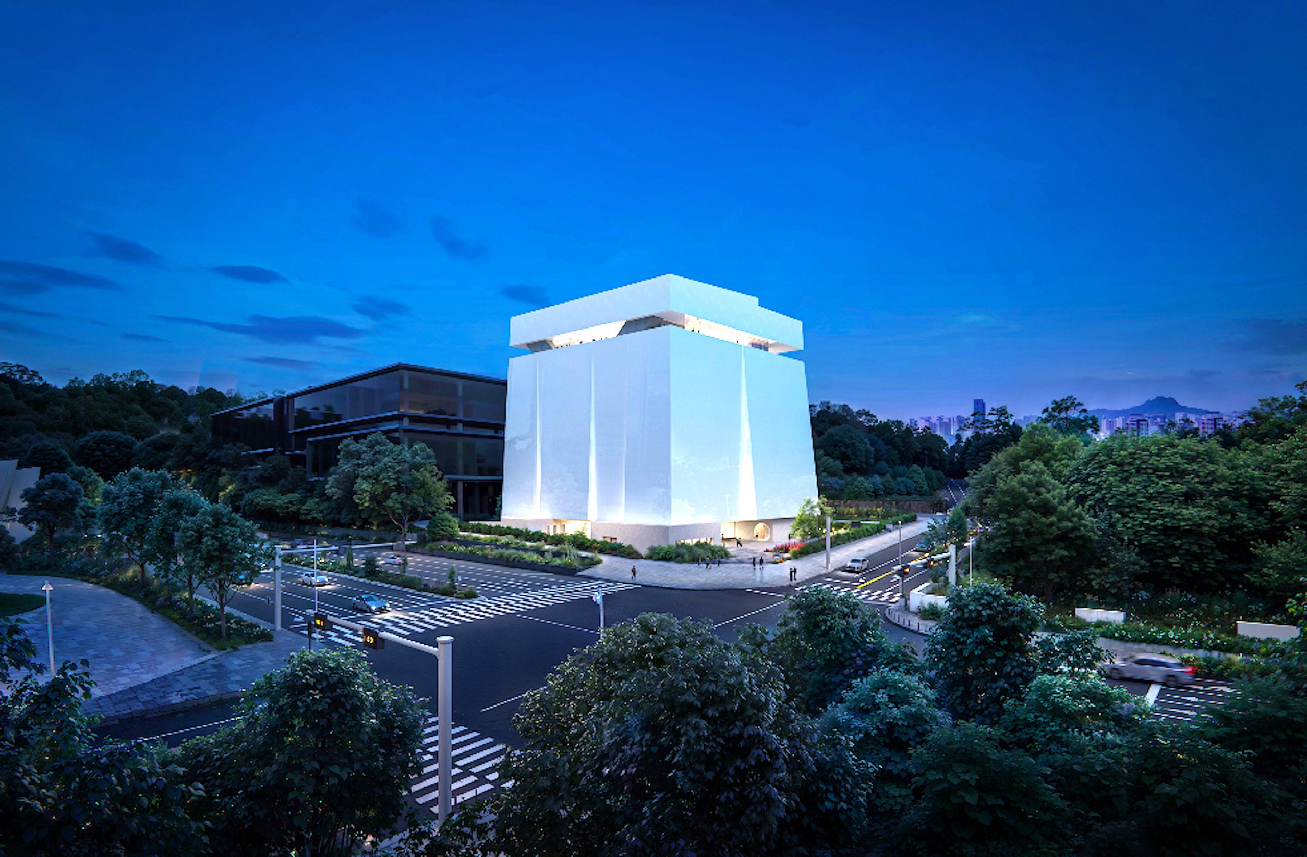
The Winning Design

Winning entry by Weiss/Manfredi (click to enlarge)
The ‘Design Loft’ entry by Marion Weiss and Michael Manfredi featured a tiered solution, whereby a continuous stairway serves as a link to all of the studio levels and crit areas on the north side of the building. This might be interpreted as an aboveground variation of the Pompidou Center’s rising, connecting system served by escalators on the exterior. The authors describe this as a “vertical campus quad, interweaving the spaces of the building into those of the campus.” Their open plate concept is intended to encourage more dialogue between the different year levels. Given that the school is now located in three different locations, better communication is a certainty, and the open-plate system would seem to encourage dialogue.
Located at the edge of campus, as a link between the university and the city, the building can serve as a significant campus arrival feature. In this, it would seem to have outshined its competitors. Its transparency is one of its greatest assets, suggesting to the visitor that the campus is a place for open dialogue and cross-pollenization
The existence of what appears to be an open library/resource area may be problematic, even with an isolated reading area. Such facilities, even in schools of architecture, are normally relegated to a secluded existence within those buildings, usually on the top floor (Ohio State University and the University of New Mexico). Students sometimes require an island for contemplation, apart from the hustle and bustle of the school’s environment. Also, many books have to be placed on reserve, and one wonders how that will be handled.


Winning entry by Weiss/Manfredi (click images to enlarge)
Finalists
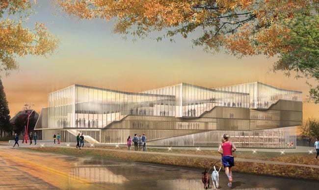
The Collaborative Inc. I Miller Hull Partnership
Rendering by The Collaborative Inc. I Miller Hull Partnership
The proposal by The Collaborative Inc. I Miller Hull Partnership chose to locate most of the studio spaces in four elevated bars,* with a meandering street as the “connective tissue.” Most of the supporting program was located on the ground level—lecture hall, classrooms, etc. The bars, cantilevered over a supporting structure, constituted somewhat of a ‘Wow’ factor and would be certain to generate a lot of attention as a campus arrival feature. On the other hand, there could be an isolation factor here, as the bars suggest segregated activity, not easily observed by other faculty and students. One could even interpret it as an ‘ivory tower’ gesture to the outside, nice to observe, but maybe not so accessible.
On the other hand, featuring the ‘bar’ arrangement provided the structure with equally interesting front and back porch views, thus setting it apart in this respect from its competitors.
*We did assume that this team did choose to locate all the studios on the second and third levels, although the floor plans did only show one studio on the third level. Also, the sections did not reveal much as to where the programs were located. So the lack of detail may have worked against this proposal.


Drawings and renderings by The Collaborative Inc. I Miller Hull Partnership (click images to enlarge)
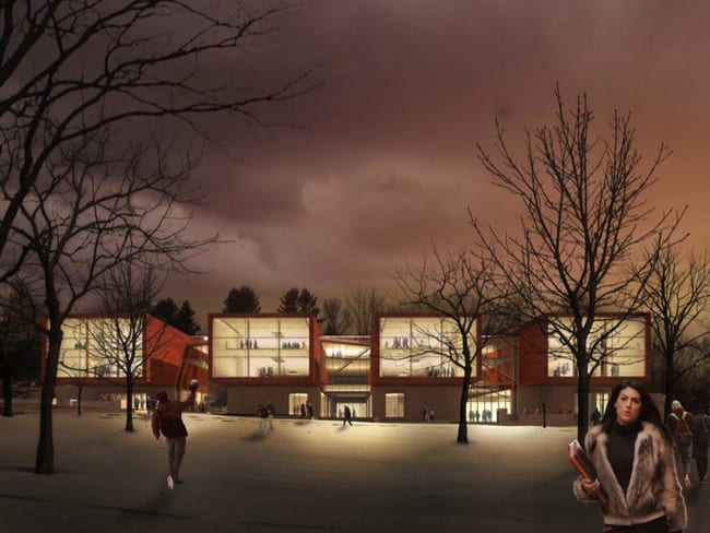
Architecture Research Office (ARO) and Bialosky + Partners
Rendering by Architecture Research Office (ARO) and Bialosky + Partners
Architecture Research Office (ARO) and Bialosky + Partners suggested a high quality precast concrete façade with an adaptive fin system to filter sunlight into the building. Here the emphasis was more on texture than transparency—although the building would project a glow effect at nighttime. This structure made more of the triangular site than the other entries, also featuring a stairs concept as connecting element to the various levels. The location and configuration of the interior commons, visible at two levels, bears quite a resemblance to the University of Cincinnati’s DAAP building’s commons area and would be a logical meeting point for students and faculty.
Organizationally, the studios were located on the top two floors, with three convenient pin-up areas for crits at the corners. An open space linking the top two floors reveals an area for contact and conversation, where you might catch a faculty member in passing, if you had a question.
A very thoughtful approach to the program, in appearance this entry brings to mind the new School of Architecture at Ohio State University, organizational differences notwithstanding. The selection committee evidently wanted something different here, obviously looking very much for a strong campus arrival feature that would make a big splash.


Drawings and renderings by Architecture Research Office (ARO) and Bialosky + Partners (click images to enlarge)
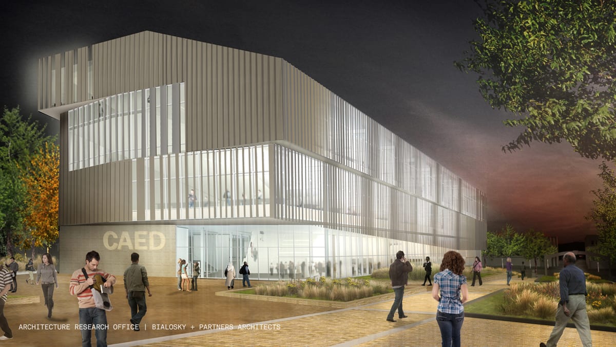
Westlake Reed Leskosky

Rendering by Westlake Reed Leskosky (click to enlarge)
The Westlake Reed Leskosky proposal contained a generous amount of glazing to go along with a textured masonry façade. The solution for the façade was based in part on a detailed contextual study of the neighboring buildings, and, in spite of some generous fenestration, led to a rather understated result. Aside from its sustainable attributes, one has to ask the question: as good as this building might be, what message does it send to the casual observer? To some, this would appear to be rather commercial, and only might be seen as an educational structure because of its location on campus.
To its credit, the building did have its strong points, especially in reference to the spatial front entrance and the large atrium. The landscaping was of very high quality, to a degree not often found at most educational institutions.
Finally, the detail in the presentation was exceptional, and well beyond what any medium-sized firm can normally produce on its own. In representational terms, it left no stone unturned and undoubtedly left the selection committee with few unanswered questions.


Drawings and renderings by Westlake Reed Leskosky (click images to enlarge)