


by Stanley Collyer
The initial structure, built in 1993 and designed by Heery International, experienced several additions over the years, the last being in 2006 by Perkins and Will, dedicated to the story of the 1996 Olympic Games in Atlanta. As often happens with additions, circulation suffered from a “disjointed floor plan” around a central corridor. As a result, most of the museum’s exhibits are hidden behind walls and meager entrances. Moreover, the footprint of the atrium is small and doesn’t serve well as a pre-function space for the much-used ballroom. Finally, the present entrance is hardly inviting as an arrival feature. To present the Center as a modern, state-of-the-art institution, a new façade and foyer certainly presented a challenge for the competition participants.
The chosen vehicle to deal with these issues was an open, two-stage competition, with a due-date for first-stage submissions set for 22 August 2011. Coordinated by a local firm, ai3, Inc., the first stage was completely anonymous, with a jury made up partially of design professionals. After the jury settled on five finalists, each team was invited separately for a review session, with the anonymity of the designs between the teams still being upheld. After reviewing all of the finalists, the museum issued a list of guidelines, which they felt should be followed. Lorenzo Mattii of the eventual winning firm, Pfeiffer Architects, noted that some of the issues pointed out by the museum had already been addressed by their initial design; so they were in the dark as to what the other firms may have neglected.
The finalists were:
• Pfeiffer Partners Architects, New York, NY
• Vines Architecture / Kenneth Hobgood Architects, Atlanta/Raleigh, NC
• Stanley Beaman & Sears, Atlanta
• MSTSD, Inc. / Kallman McKinnel & Wood , Atlanta/Boston
• patterhndesign, St. Louis, MO
The Second Stage
Each of the short-listed finalists received $5,000 to fine-tune their designs in the second stage with the requirement that they submit a model of the building. As an added incentive, the eventual winner would receive $15,000.
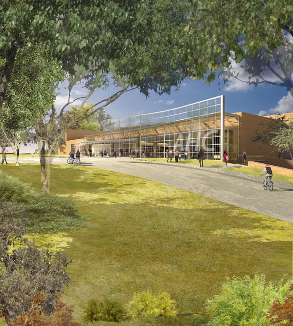
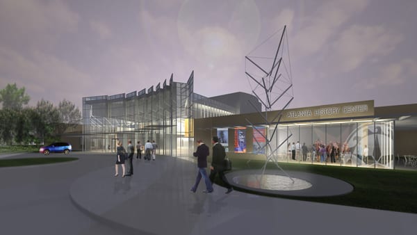
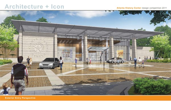
The Winning Design: Pfeiffer Partners Architects
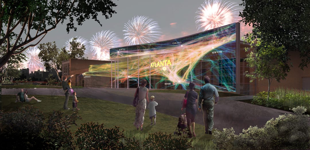
A second-stage jury, made up primarily of laypersons having a vested interest in the Museum, selected Pfeiffer Partners Architects of New York as the winner. Besides solving many of the circulation problems encountered in the existing structure, the firm’s conceptual tour de force for the much needed re-do of the front façade was not only a modernizing moment, but by stretching the skin beyond the entrance area, it avoided the usual cosmetic makeover. In some ways it is reminiscent of Jean Nouvel’s Fondation Cartier and Musée du Quai Branly, albeit at much closer quarters. In the first stage their design even included an electronic billboard, which the firm decided to drop in the second stage, retaining only the digital strip at the top (See phase I and phase II boards). Mattii explained that they did not want their chances to sink or swim based on technology. Besides, neighbors might have perceived this form of institutional display as a little over the top for this neighborhood.


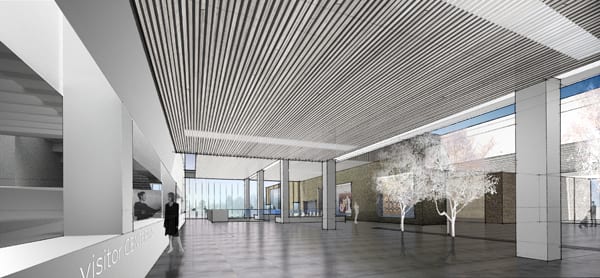
As for the main circulation spine on the main floor, the galleries were not altered, only touched at the edges. But the biggest change—which must have pleased the jury—was the creation of direct access from parking to the main lobby by moving the seminar room and classrooms from the lower level to above, and bringing light below by revealing a large opening to the upper level at a stairwell. All of this enabled this lower level space not only as access for those using the parking garage, but also serve as a collection point for group tours. Those parking their cars would now be able to gain direct access to the museum undercover, and not be required to walk around the outside perimeter to the entrance. Finally, the subtle, but important circulation improvements may have been an indication to the client that this proposal could well be accomplished close to the budget guidelines.


Finalist: Stanley Beaman & Sears
Of all the finalists, the Stanley Beaman & Sears scheme provided the greatest visual contrast. Here emphasis was on transparency, with a generous portion of glazing at the front entrance as a calling card. A wave created by ribbed elements in the ceiling, leading down the central spine, served to lure visitors along a path to exhibits and ballroom, with an additional corridor providing an island in the middle of the existing structure for temporary exhibits. The architects went to considerable lengths to explain in detail how the museum would actually look and function on the inside with a large number of exquisite renderings. Although not the winner, this was certainly a conversation piece, which must have generated some interesting discussions.


Finalist: Vines Architecture / Kenneth Hobgood Architects
The entry by Vines Architecture / Kenneth Hobgood Architects concentrated almost entirely on changes to the central circulation spine. Here the most significant intervention was the addition of a narrower second level, not only extending the length of the circulation spine, but also extending out beyond the facades of the building to form an overhang at the drop-off area at the front entrance, and a viewing platform to the campus at the rear. This area also provided space for traveling exhibits and classrooms. While this elevated platform element was a bold statement, solving some of the space problems and lending the building a modern touch, the total treatment of the front façade was unclear, though one of the renderings did suggest that there would be some needed significant changes to this ordinary, pseudo-classical feature.


Finalist: patterhndesign
The most radical circulation change was proposed by patterhndesign. Not only did they suggest a new entrance, but also two new wings—one to be added later— as the principal features of their intervention strategy. The generous spaces created by this scheme resulted in a look not unlike that of the British minimalist, David Chipperfield, architect of the Neues Museum addition in Berlin. The new wing and re-orientation addressed two critical issues: improved accessibility for the diverse visitor group from the garage and better connections to the larger campus and improvement of campus landscape/grounds. The new wing also extends the visibility of the north facade/north entry and allows the new lobby space to exist. It is the only scheme to not rely heavily on corridors and hallways. Apart from the imagery, the strength of this design rests on its generous spatial treatment of the interior.


Competition boards by patterhndesign (click to enlarge)


Finalist: MSTSD, Inc. / Kallman McKinnel & Wood
The proposal by MSTSD, Inc. / Kallman McKinnel & Wood was significant for its more conventional entrance feature, based on the rhythm of Georgia’s antebellum architecture. The interior circulation changed from the existing single spine to two corridors, alleviating access to the various galleries. This presentation was heavy on illustrations of the firm(s) previous projects, an unmistakable hint that this team could be counted on as a serious choice, based on its portfolio.


All of the above teams presented differing strategies for solving the museum’s image and circulation concerns. The choice of Pfeiffer Partners Architects as the winner, with its somewhat low-key, but elegant approach to the problem must have been the deciding factor in their selection by the museum.