


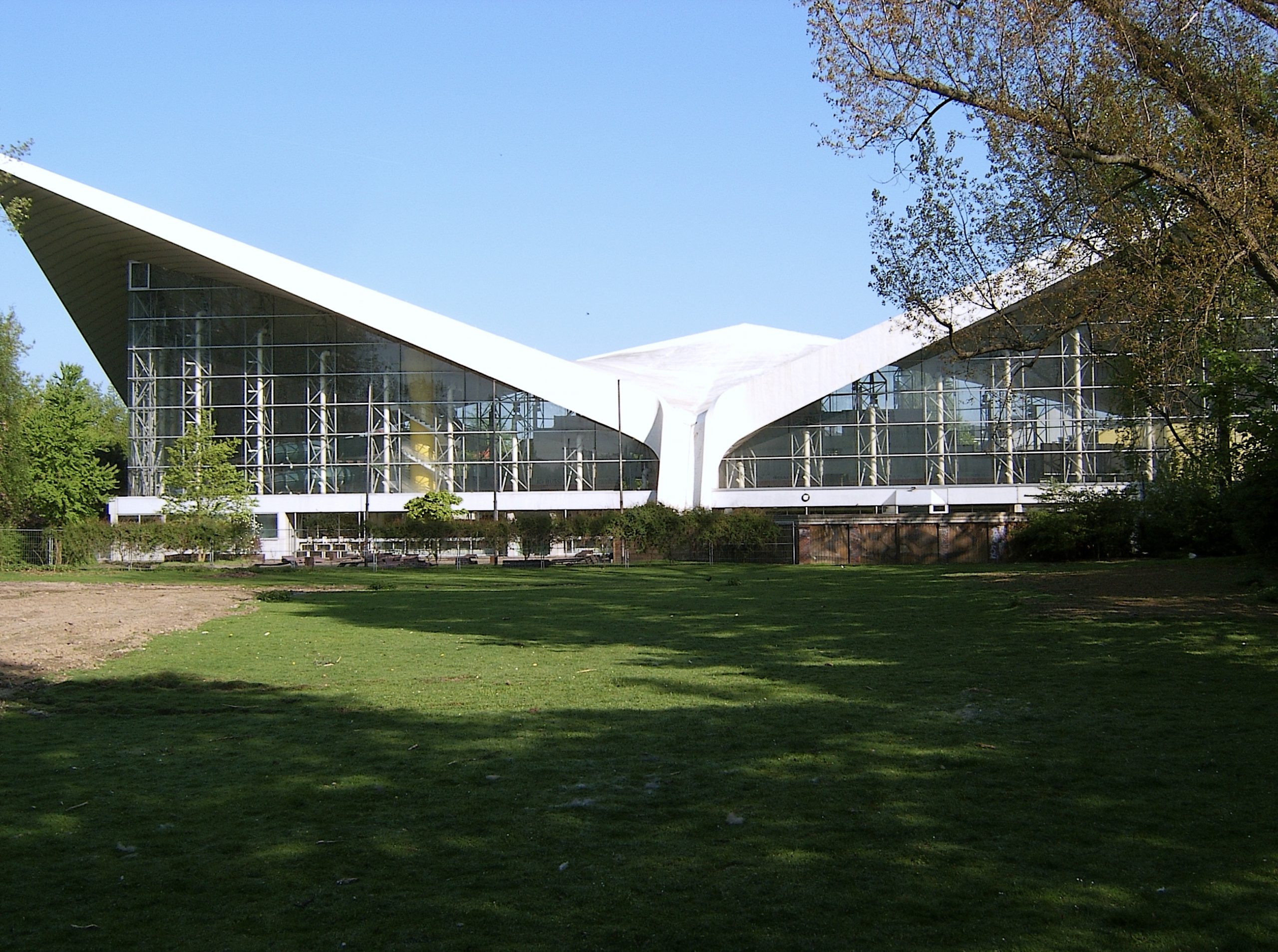
Like many American universities in the late 19th and early 20th centuries, the University of Chicago viewed Gothic architecture as a recognizable symbol to suggest academic excellence in the tradition of Ivy League universities and Oxford. In this, Chicago was not alone, as other schools used a similar formula to imply a connection to a pre-existing academic tradition—Duke University and Butler University in the 1920s being prime examples. As time passed, and to accommodate Chicago’s reputation architecturally as a forward-looking community, the university gradually hired contemporary architects such as Eero Saarinen, Mies van der Rohe, Edward Larrabee Barnes, Walter Netsche and Harry Weese to add to the university’s built fabric. Beginning with the early 21st century, the look on the campus has been updated even more to reflect current trends with buildings by Cesar Pelli, Helmut Jahn, Rafael Viñoly, Joe Valerio, and most recently, the musum by Tod Williams and Billie Tsien.
One of the university’s recent priorities is to increase on-campus student residency, eventually raising the number of undergraduates who can live on campus from the present 50% to 75%. To facilitate this plan, Harry Weese’s Pierce Hall Residence, has fallen victim to the wrecking ball to make room for a new, much larger residency hall complex on the north campus. If Harry Weese were still around, he would certainly be saddened by his building’s fate, but no doubt would have greeted a competition as a way to rebuild on the site. Thus, in 2013, as part of an invited competition, four high-profile firms were invited to compete for the design of a new student residential and classroom complex on the site. They included two Chicago firms, Perkins & Will and Studio Gang, and two international firms, Bjarke Ingels Group (BIG) from Copenhagen, and Hopkins from the U.K. They were shortlisted after an extensive search process and were each to receive $250,000 upon submission of their entries.
After the four shortlisted firms submitted their ideas, the field was narrowed down to the two Chicago firms, both going back to the drawing board after receiving feedback from the client. In the final, third phase, Studio Gang’s presentation prevailed and, partnered with Mortensen Construction, has been commissioned to proceed with further development of the project.
According to University of Chicago architect, Steve Wiesenthal, the schemes from both Hopkins and BIG were more “inward looking,” concentrating primarily on the building, rather than site development. On the other hand, the two Chicago firms showed “a better understanding of the site and how it related to the neighborhood and campus fabric.”
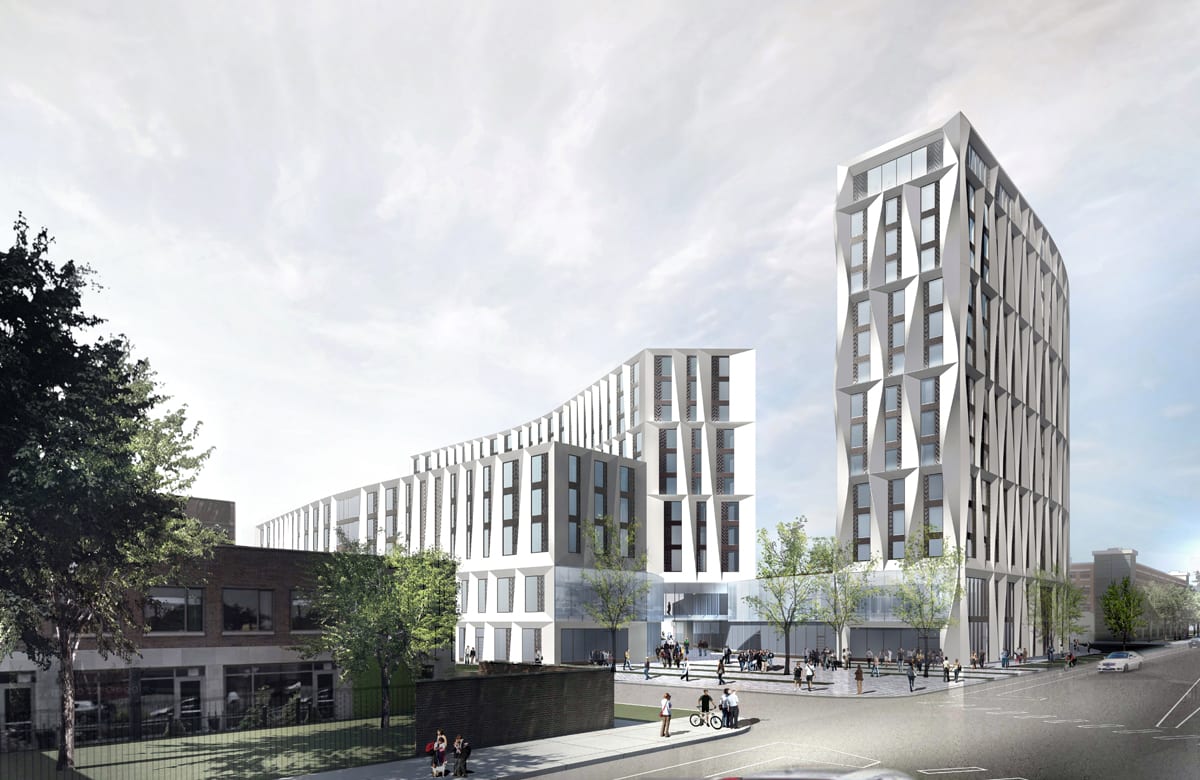
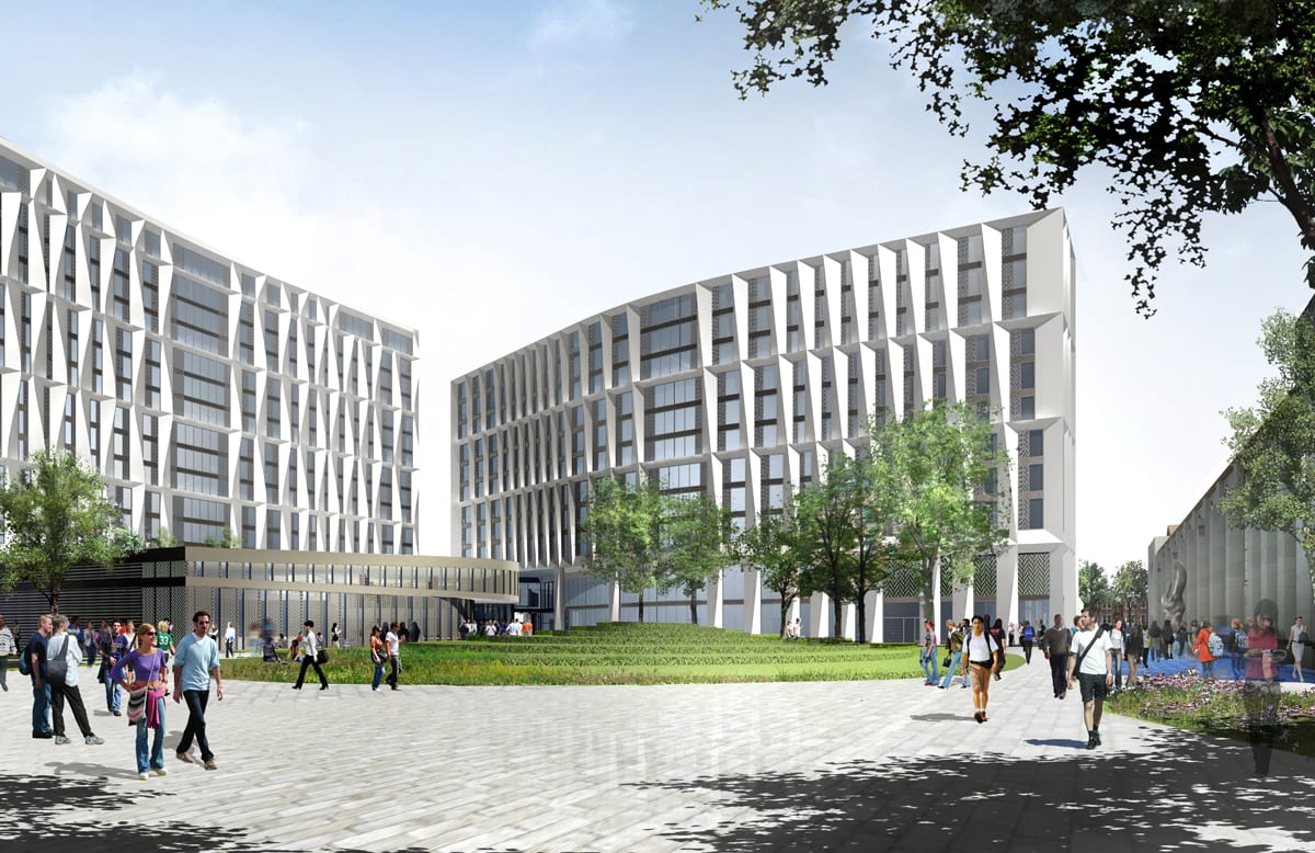
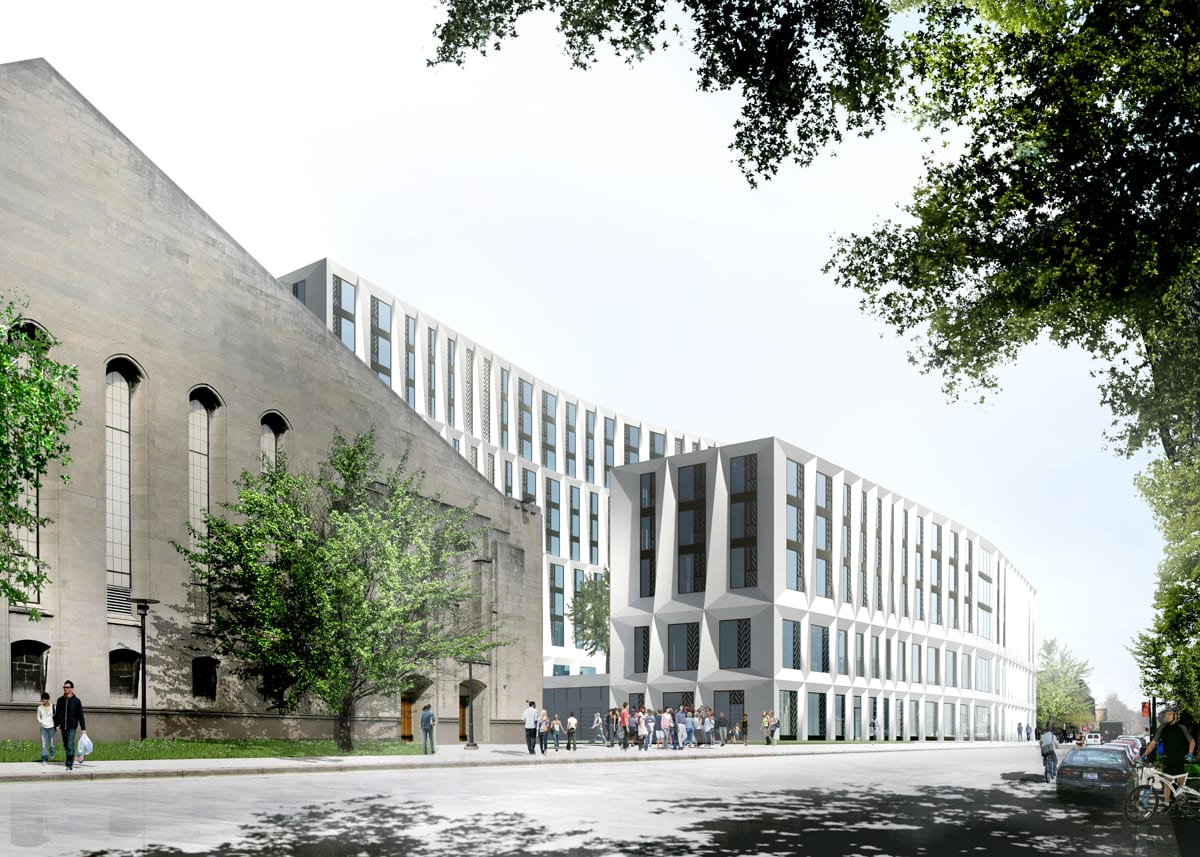
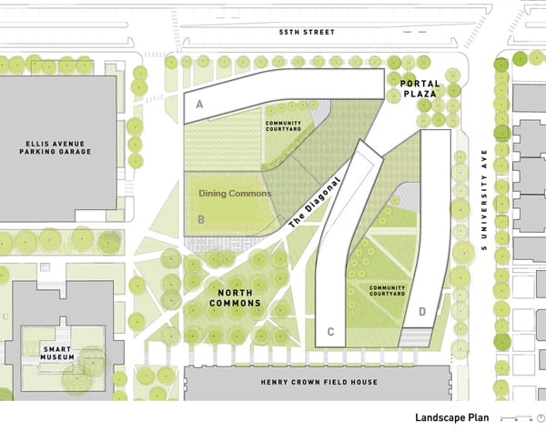
The competition site itself presented its challenges. It was flanked on two sides by the Ellis Avenue parking garage to the west and the Henry Crown Field House to the south—hardly ideal conversation pieces. From a visual perspective, the only friendly neighbor in that sense was Edward Larrabee Barnes’ Smart Museum at a far corner of the site. Studio Gang’s solution to this problem was to locate two of the lower buildings (“C” and “D” in the diagram) at a vertical position to the Field House, while situating the main, larger hall on 55th Street, where Weese’s Pierce Hall had once stood. This created a large “Commons” area with an unobstructed view from the entrance portal at the corner of 55th Street and South University Avenue to the Smart Museum.
Conversely, Perkins & Will opted for a large L-shaped structure occupying the perimeter along 55th Street and extending around to University Avenue, framing a large green space and occupying a significant area around the perimeter. Although Perkins & Will did see plantings as a solution to minimize the effect of the Henry Crown Field House’s blank wall, that structure still presents a visual factor to be dealt with.
Besides presenting quite different plans in site circulation, there were marked differences in architectural expression. Studio Gang’s approach was more subtle than Perkins & Will’s exuberant proposal. Gang’s design featured a squewed fenestration program, providing the facades with a less monotonous, less corporate-looking texture. This precast system no doubt referenced some of the pre-Word War II architecture on the campus and apparently struck a positive chord with the selection committee. In Jeanne Gang’s words, they were “not simply replicating” the Gothic architecture on the campus, but referencing it. On the other hand, Perkins & Will visualized a tall, sloped structure, which could easily have been understood as an immediate campus icon, taller than most other buildings on campus. This building changed slightly between stages two and three, whereby the far edge on University Avenue had the façade jutting out irregularly from one floor to the next. The final version saw that edge straightened, forming a slanting, deconstructivist line from top to bottom. Had this been an anonymous process, the committee might have assumed that the origin of the design came from BIG, and not Perkins and Will.
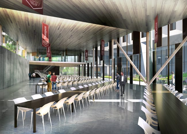
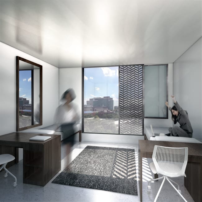
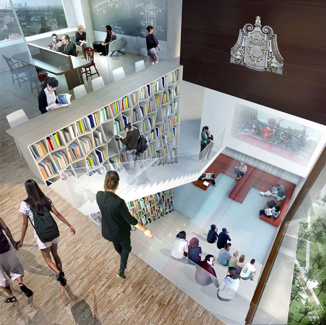
Studio Gang’s design for the residence halls featured a stacking program, whereby three floor residential units were connected to a hub in the middle of each building where students could meet—“collaboration zones.” Retail and other services were on ground level, and the dining commons was situated as a separate structure, jutting out from building “A.” Perkins & Will’s meeting and lounge areas for students were located in various locations, including a “common floor.” Although these amenities may not have been quite so prominent to the outside viewer as Studio Gang’s “hubs,” they appeared to be readily accessible and sufficient, considering the volume of users.
Entry points to the site’s interior for the Perkins & Will plan were much the same as for Gang Studio’s. Both had entrances at the corner of 55th and University, passing under the structures into the open commons area. The other entrance points were identically located at the far corners of the site, both on 55th and University. Jeanne Gang emphasized their corner entrance as a “portal,” an important arrival feature to the site.
It was apparent that a strong iconic statement was not an overriding element in the selection committee’s final decision: the Perkins and Will scheme was the only proposal which one might have placed in that category. All of the other entries appeared to approach the architectural expression issue as a somewhat modern, complementary reference to earlier campus architecture. Theirs was a more cautious approach. Perkins and Will might well have assumed that their challenge in an iconic approach to the design challenge would have come from BIG, which turned out not to be the case.
The university’s program for this project, not only stipulating student residences, but classrooms, dining and other amenities, suggests that it can play a greater role on this campus, especially since the University of Chicago’s campus is without a designated student union. Architecturally speaking, there is already much to see on this university campus; and the addition of this important building block can only add to the buzz. If there was one somewhat curious stipulation in the program to the outsider, it was the linear organization of the dining area, which was the main idea behind the university’s traditional “college house” plan. In today’s trend toward a casual approach to campus dining, this might seem to some as harking back to the trappings of a bygone era.
Studio Gang with Mortenson Construction (winning entry)
Chicago, Illinois
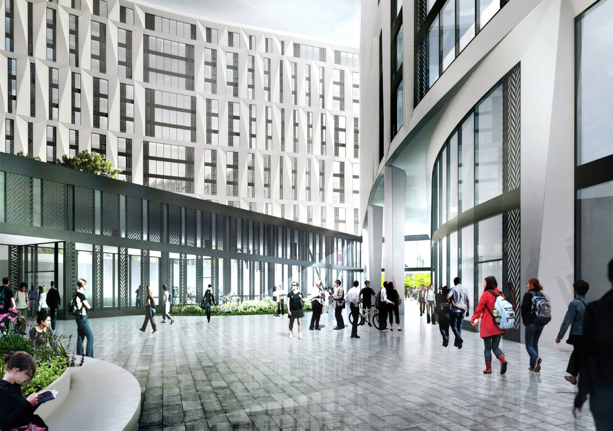
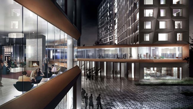
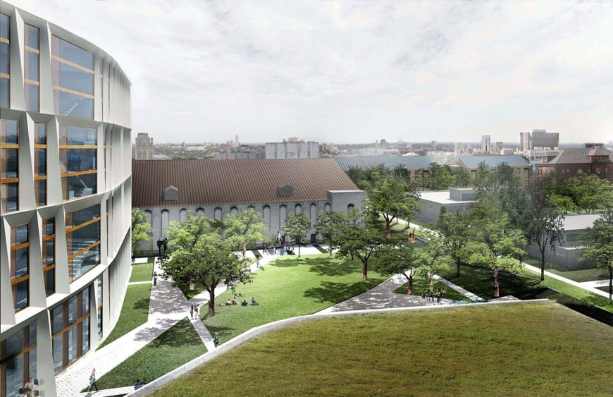
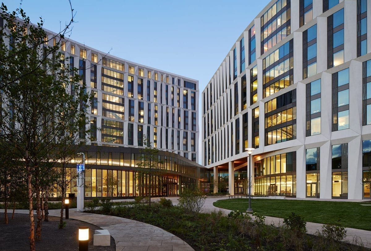
The team led by Jeanne Gang, provided the structure with a less corporate look by using recessed fenestration, framed by sculptural precast units. By allowing views into the “hubs” with multistory windows, the possibility of a monotonous façade is also avoided. The entryway though a main portal at the corner of 55th and University provides energy to the site plan with a view to the Smart Museum.
The use of medium-highrise structures for the residence halls is a formula for creating a comfortable campus environment. At this writing, the landscape plan was under review and will undoubtedly see improvement with further development. In this sense, the uninteresting blank façade of the Henry Crown Field House might present the greatest challenge visually.
Completed project, photo Steven Hall © Hedrich Blessing; courtesy Studio Gang
For more photos of the completed project, go to our Interview with Jeane Gang.
Perkins and Will (runner-up)
Chicago office


Phase 1 rendering and plan by Perkins & Will (click to enlarge)—Images courtesy Perkins and Will
Perkins and Will recognized the value of framing the site with an L-shaped, terraced structure on one side, situated along 55th and University. This opened up the site for various possibilities, including a separate dining area and was certainly the strength of their proposal. In the first phase, the open area was highly organized into several functions, but simplified in the final phase presentation—possibly for maintenance purposes? The changes from the first to the second and final phase presentations is well documented and gives us much insight into the feedback between architect and client, leading to changes in the final phase. The Perkins and Will proposal was a very high-density approach at the edges and, although, addressing all the program requirements, could be regarded as an ivory tower solution, at least visually placing a contingent of students at the top, somewhat removed from the socialization process—and, at least symbolically, the neighborhood.
Hopkins Architects (Finalist)
London, UK


A visually enclosed quad scheme is the basic approach of the Hopkins team. By doing so, it would suggest from the outside that the student residents are somewhat isolated from the neighborhood, although they would obviously be within walking distance of many of their classes. Their plan consists of only one major entrance to the inner courtyard, and residence halls, with outside access to a public dining area. The student dining area was next door, separated by an outdoors, covered passageway from the Henry Crown Field House (The blank wall of the Field House thus became a non-issue.) The building(s) surrounding the perimeter were typically penetrated by setbacks, providing more glazed surfaces for outdoor light. But the lack of prominent entrances to the interior gave it the appearance of isolation from the rest of the neighborhood, and placing a higher emphasis on security.
BIG – Bjarke Ingels Group (Finalist)
Copenhagen, Denmark


BIG’s solution for the site was a figure 8 configuration of the residence hall buildings. This arrangement resulted in the creation of two interior courtyards; however, the height of the surrounding building(s) indicated that there might be very little sunlight, not only in the winter, but also in early spring and late fall. The only sign that this was a BIG design was the slightly sloping green roof, complete with vegetation and walkways. The result: a “sky garden.” The figure 8 plan created two enclosed courtyards, more a token green space to inject some fresh air into the complex, rather than forming a generous verdant environment. Here the authors can argue, with some validity, that the sky garden, available exclusively to students, together with the large plaza to the southwest boundary of the site, is the greenest of all the entries. The penetration of the complex occurs at two points, one at the intersection of 55th and University, and the other—described as the main entrance—at the rear. The entry from 55th and University is certainly higher profile, considering its relationship to the neighborhood.